Tutorial
The Disciplined Duo: Integrating Volatile Display Type with Steady Text Faces
Insights, tutorials, and type notes from the Timeless Type studio.
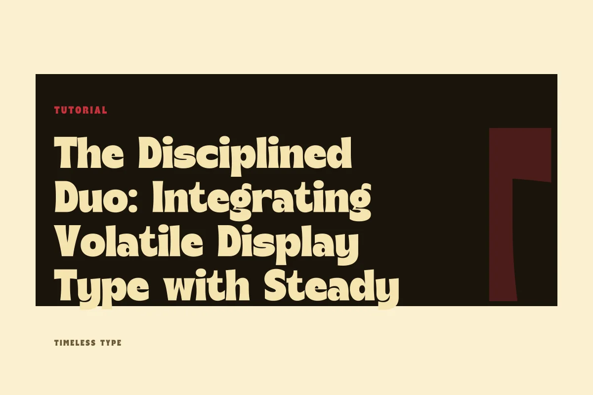
A hands-on manual for matching eccentric display headlines with disciplined body copy across editorial posters and web interfaces without causing structural friction.
Table of Contents
Establishing the Division of Labor
Every successful two-face typographic system depends on an uncompromising division of labor. When you select an expressive display typeface for a brand landing page or an exhibition poster, that face assumes total responsibility for tone, attitude, and immediate visual capture. Its job is not to deliver long-form paragraphs or sustain micro-reading. Conversely, the accompanying secondary typeface exists to convey structural details, body copy, subheaders, and tabular notes with maximum optical neutrality. Problems arise when designers treat these two roles as collaborative rather than complementary, expecting both selections to carry emotional weight.
Consider an assertive headline typeface like Dream Waves - Serif Display Font. With its sweeping curves and organic contrast, it immediately commands the visual field. If you place it alongside an expressive text face—such as an embellished semi-serif or a calligraphic sans—the two typefaces compete for the reader's attention. To maintain clarity, the text typeface must deliberately recede. It should serve as an architectural anchor, organizing paragraphs and metadata into clean, legible grey blocks that let the headline retain its singular focal authority.
Measuring Contrast Beyond Stroke Weight
Many designers evaluate font pairings purely through stroke thickness, pairing an ultra-bold headline with a book-weight paragraph font. While weight contrast is essential, structural contrast is what actually stabilizes a composition. If both typefaces share similar skeletal idiosyncrasies, such as dramatic axis tilts or tight aperture terminals, they create optical dissonance. True harmony in a two-face composition relies on clear differences in skeleton, rhythm, and origin.
When working through the options in our font catalog, look for textural divergence. A compressed, vertical display face like Newstan – Tall Condensed Sans Serif creates dense vertical striping in large headlines. Pairing it with a narrow condensed body face produces a visual corridor that feels cramped and exhausting to read. Instead, balance that tall vertical tension by setting supporting text in a wide, humanist or neo-grotesque sans with open counters and generous tracking. The wide breath of the text blocks softens the tight cadence of the headline, anchoring the page with geometric equilibrium.
Reconciling X-Height and Vertical Proportions
Mismatched vertical metrics are among the most common technical oversights in two-face compositions. While a display face and a text face rarely occupy the same line of text, their perceived visual density across a layout depends heavily on how their proportional proportions align. A display font with a compressed x-height and dramatic ascenders demands generous white space around it; placing it above a text face with a towering x-height and truncated descenders creates an uncomfortable optical imbalance, where the body copy feels heavier and clunkier than the header above it.
To tune this relationship, calculate visual optical balance rather than relying strictly on point sizes. If your display face features elongated proportions, ensure your body text uses proportional line height—often 140% to 160% of the text size—so the paragraph texture remains airy enough to support the display header. For posters and digital hero sections, test how subheadings interact with the headline. When intermediate subheads use the text face set in medium or semi-bold weights, monitor the cap-height of both faces to prevent intermediate lines from looking like an accidental, poorly sized variant of the primary headline.
Layout Diagnostics: Identifying Pairing Failures
When evaluating a layout, you should immediately diagnose where the interplay between display and text breaks down. Pairings rarely fail uniformly; they fail at specific intersections where typographic rules are stretched beyond their functional limits.
- Proximity crowding occurs when display ascenders and descenders intrude into the lead paragraph, collapsing the necessary buffer between expressive shape and readable texture.
- Intermediate confusion happens when secondary headers are set in the display face at small sizes, turning distinct expressive details into muddy artifacts.
- Counterfeiting occurs when the text face mimics stylistic features of the display face poorly, producing visual conflict rather than clean functional contrast.
- Weight inversions materialize when bold text labels overpower a delicate, high-contrast display title across smaller viewports or print cards.
If you notice any of these symptoms while refining a layout, resist the temptation to introduce a third typeface. Adding more type families almost never resolves friction in a two-face layout. Instead, solve the issue through baseline adjustments, letter-spacing corrections, or a stricter enforcement of hierarchical roles.
Setting Up Robust Production Rules
Once you have balanced your display headline with a restrained text face, codify their rules into clear production standards. On a digital brand page, restrict the display typeface exclusively to the primary hero heading and key section dividers. All interactive elements, captions, navigation bars, and editorial paragraphs should remain strictly within the domain of your workhorse text face. This clean separation ensures that changes in screen size or responsive reflow never compromise legibility.
On physical posters and large-format print applications, review the text hierarchy from standard viewing distances. A viewer should absorb the atmospheric punch of the display face from ten feet away, while the body text should invite closer inspection without competing for initial recognition. Before finalizing high-volume collateral, verify your implementation rights against your foundry commercial license to ensure webfont and desktop deployment tiers match your actual distribution. By holding your display face to expressive boundaries and keeping your text face neutral, your two-face system will remain resilient across every media format.
Related
Tags
Browse similar work by purpose and style.