Tutorial
Structural Counterbalance: Practical Rules for Setting Display Heads Against Quiet Text
Insights, tutorials, and type notes from the Timeless Type studio.
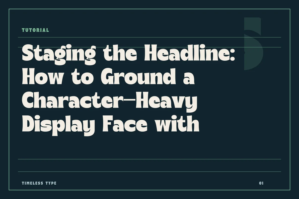
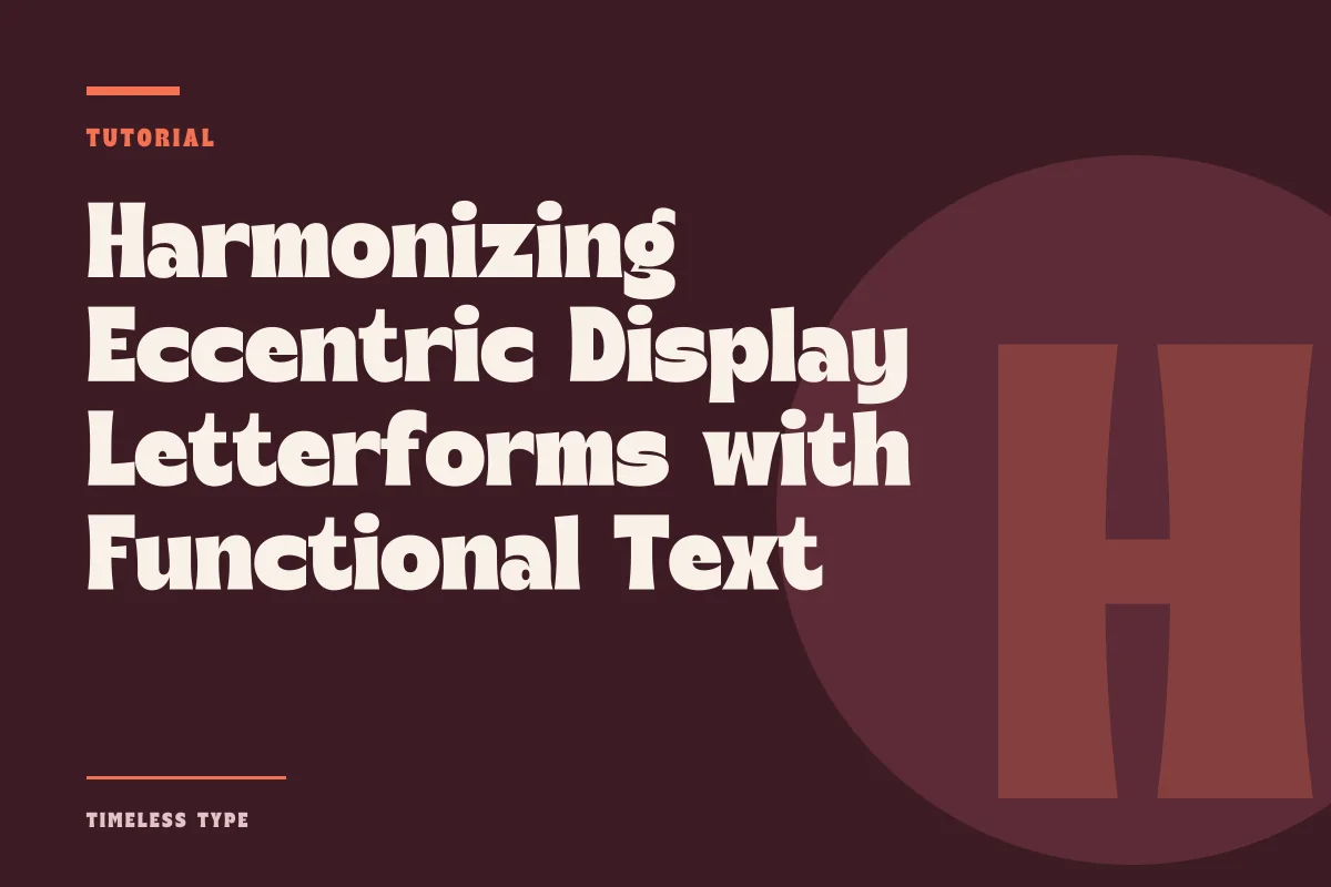
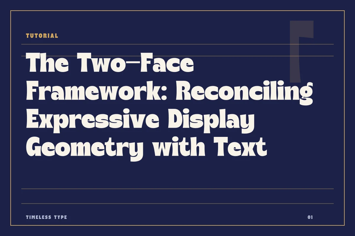
Pairing an assertive display typeface with an unobtrusive text face requires deliberate management of stroke contrast, proportional x-height, and hierarchy thresholds.
Table of Contents
The Functional Division of Typographic Labor
Every successful two-face layout operates on a strict division of responsibility. A display face exists to command optical priority, establish tonal atmosphere, and arrest the viewer's eye across a crowded composition. A quiet text face performs the opposite duty: it yields visual precedence, minimizes friction during extended reading, and sustains an uninterrupted rhythm across multiple lines. When designers encounter difficulties pairing these two categories, the friction usually stems from ambiguous roles. If a text face attempts to inject its own idiosyncratic flair, or if a display face is pressed into service beneath its legible threshold, the overall typographic system loses clarity.
Consider an expressive headline face such as Dream Waves - Serif Display Font or Lemon Burst - Groovy Display Font. Both possess distinct contours, expressive stroke variation, and undeniable character. Because these faces carry high visual energy, the companion text face must be emotionally neutral and structurally resilient. Asking an expressive face to share the page with an equally vocal text face creates acoustic competition. The eye bounces between competing details instead of reading through a sequential hierarchy.
Gauging Structural Contrast Across Stroke and Skeleton
Successful pairings rarely rely on visual resemblance; they rely on calibrated contrast. Attempting to match a display serif with a text serif that shares similar brackets or serifs often results in an uneasy near-miss. Unless two faces originate from a single cohesive superfamily, small discrepancies in terminal treatment, axis tilt, and stroke modulation register as accidental errors rather than deliberate harmony.
Instead, establish clear structural contrast between the skeleton of the headline and the skeleton of the body copy. If your primary display voice is a high-contrast serif like Manile Vintage - Modern Bold Serif, partner it with an unadorned, low-contrast grotesque or neutral humanist sans serif. The abrupt shift from dramatic stroke modulation to uniform stroke weight clarifies hierarchy instantly. The display face provides the silhouette and historical flavor, while the neutral sans provides a sturdy horizontal track for information retrieval. When reviewing combinations in our wider library at all fonts, look for text candidates that remain completely indifferent to the decorative tendencies of your chosen headline.
Reconciling Vertical Metrics and X-Height
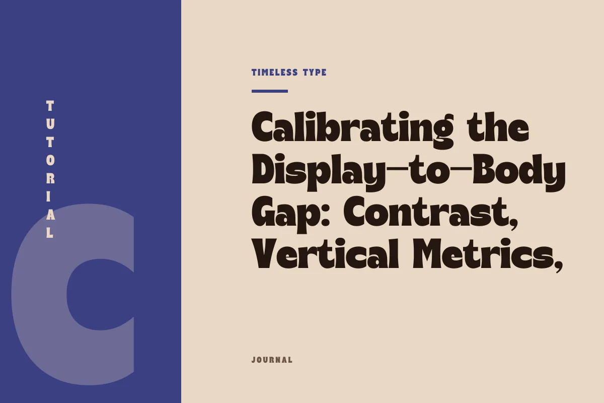
While skeleton and stroke modulation thrive on contrast, vertical proportions demand structural coordination. The relationship between the x-height of your headline and the x-height of your running text determines whether a layout feels cohesive or discordant. A display typeface built with tight ascenders and an exaggerated x-height projects dense graphic weight. If the companion text face features miniature x-heights and long, elegant extenders, the sudden shift in spatial density will fracture the vertical rhythm of the page.
To stabilize the layout, examine the relative proportions of both typefaces at their intended optical scales. A text face chosen to sit beneath an assertive display header should feature generous counters, moderate-to-tall x-heights, and open apertures. This architectural openness keeps the body copy legible at small point sizes without requiring excessive tracking. Ensure that the leading in your running copy accommodates the ascender and descender reaches without colliding, creating an even, light-gray tonal texture that contrasts cleanly against the dark, deliberate strokes of your title.
Breakdown Points in Poster and Digital Layouts
A pairing that appears balanced in an initial sketch can easily collapse under real-world production conditions. Breakdown points typically emerge at the boundary zones: subheadings, captions, pull quotes, and intermediate decks. When a layout demands a third hierarchical level, inexperienced designers often default to shrinking the display font down into subheads. This invariably fails because genuine display letterforms are drawn with tight spacing, delicate thins, and tight counters that plug up and deteriorate below headline scales.
The breakdown can also occur when responsive web pages re-wrap headlines into multi-line blocks. A character-rich display face set over four or five lines quickly overwhelms the viewport, crushing the text block beneath it. In poster layouts, failure often occurs through proportional negligence, where the size ratio between headline and body copy is too shallow, such as setting a headline at thirty-two points and the body copy at twenty points. A ratio that modest forces the two faces to debate primacy. For high-impact work, commit to decisive scale differences: pair a seventy-two-point display headline with an eleven-point text block, letting white space mediate between the two.
A Diagnostic Routine for Testing Two-Face Systems
Before locking a display and text pairing into a final mechanical file or brand guidelines document, stress-test the duo against systematic benchmarks. Evaluating letterforms through strict mechanical criteria removes subjective guesswork and reveals structural flaws before delivery.
- Scale threshold testing: Confirm that the display face is never deployed smaller than its intended threshold, and verify that the companion text face maintains clear word shapes down to nine or ten points.
- Tonal density evaluation: Squint at the composition from a distance; the display face should form a decisive dark accent, while the text block forms a uniform, calm gray tone without dark blotches or thin dropouts.
- Inter-line collision clearance: Verify that the leading of the text copy provides ample clearance for all diacritics and ascenders, ensuring no accidental touching occurs near the baseline of the headline.
- Subhead delegation: Assign intermediate hierarchy levels—such as metadata, section tags, and small deck copy—to weighted variations or tracked caps of the text face rather than scaling down the display face.
- Licensing alignment: Verify that your font weights and formats cover both desktop editorial proofs and production embeddings by reviewing the parameters outlined in our commercial license.
Restraint as a Compositional Tool
A striking display font does not need a vocal partner; it needs a steady foil. By selecting a text face that performs quietly, respecting vertical metrics, and asserting uncompromising scale contrast, you build an enduring layout that delivers both immediate graphic impact and sustained reading comfort. Great typographic pairing is fundamentally an exercise in discipline, allowing a single expressive voice to lead while the remaining architecture supports the message with clarity and poise.
Related
Tags
Browse similar work by purpose and style.