Tutorial
Calibrating the Typographic Anchor: Practical Duos for High-Impact Compositions
Insights, tutorials, and type notes from the Timeless Type studio.
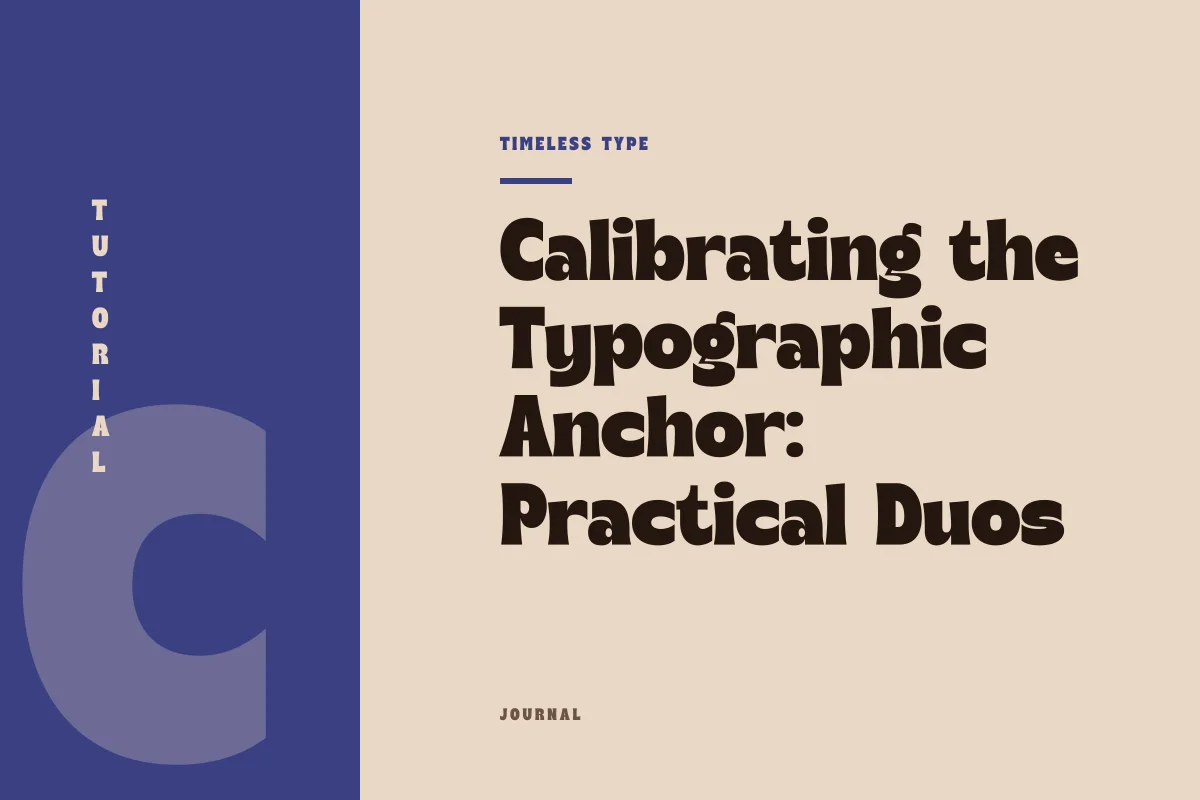
A practical guide to coupling expressive display letterforms with understated body copy across posters and brand pages without muddying layout hierarchy.
Table of Contents
The Dynamics of Asymmetric Typographic Roles
Every successful two-typeface composition functions through clear specialization. When designing an event poster, editorial spread, or landing page hero, granting two different fonts equal visual claim over the layout invariably fractures reader attention. Instead, establishing one voice as the graphic anchor and the other as the functional substrate gives the layout immediate stability. An assertive display design commands scale, silhouette, and mood, while an understated text counterpart carries paragraphs, annotations, and interface data without competing for attention.
To achieve this, designers must resist the urge to pair fonts simply by surface similarity. Pairing two expressive faces or choosing two fonts with slightly competing structural motifs introduces visual noise. The goal is intentional difference: structural tension paired with functional clarity. By understanding how contrast, physical proportion, and vertical metrics interact, you can ground even the most dramatic display shapes in steady, reliable body setting.
Evaluating Stroke Weight and Structural Contrast
Contrast between display and text faces is not merely a slider between thin and thick strokes. It encompasses contrast of stroke modulation, skeleton construction, and internal rhythm. A bold, high-character face such as Manile Vintage - Modern Bold Serif brings organic transitions, sharp terminals, and sculpted curves to large scales. If you pair such a face with a secondary serif that also exhibits pronounced modulation, the reader’s eye struggles to process two distinct historical languages at once.
When your display headline features strong thick-to-thin transitions, your supporting text face should generally lean toward uniform stroke thickness and low contrast. A neutral, geometrically calm sans serif or a robust text slab settles the visual field, absorbing the ornate weight of the header. Conversely, when pairing a mechanical, low-contrast display choice like Hurst Bagod - Futuristic Sans Serif Font, introducing a quiet, traditional text face with steady humanist proportions provides a welcome organic foundation that softens the headline's industrial austerity.
Harmonizing X-Height and Vertical Metrics
While display fonts are judged by their silhouette at large points, workhorse text type must operate comfortably at sizes ranging from 9 to 14 points. The primary variable governing that comfort is x-height—the relative height of lowercase letters compared to capitals. A display face might feature exaggerated ascenders or an ultra-compact x-height to maximize drama, but your accompanying text font must prioritize open counters and an ample, legible mid-zone.
Problems arise when vertical proportions clash during multi-tiered reading experiences, such as subheadings running adjacent to body copy. If your subhead uses an expressive face with short extenders and your text face uses elongated extenders, line baselines can feel jagged and disconnected. When assessing type combinations across our collection at Timeless Type fonts, evaluate both specimens side by side at their intended working sizes. Ensure that the text font possesses generous counterforms and adequate line spacing so that it does not collapse into dense, unreadable horizontal stripes beneath a dominant headline.
Recognizing the Points Where Pairings Break Down
Even thoughtfully selected pairings fail under certain compositional stresses. Knowing when a typographic system disintegrates helps you course-correct before committing to an entire design system. Look for these four breakdown points during production:
- Mid-tier ambiguity: The text face is scaled up to form a subhead, but its neutral character lacks authority, causing it to look like a draft placeholder beneath the display headline.
- Counterform dissonance: A rounded, fluid display face is coupled with a rigid, condensed text font whose apertures are too tight, causing optical vibration when read in sequence.
- Density inversion: The body text block renders darker in overall page value than the headline, pulling the eye downward prematurely and upending reading hierarchy.
- Scale overextension: An eccentric headline font like Dream Waves - Serif Display Font is mistakenly forced into deck copy or long callout quotes where its decorative strokes degrade into visual static.
When you encounter these symptoms, the resolution rarely involves swapping both faces. Instead, re-examine the division of labor. Either push the text face down into a slightly smaller size with wider leading, or pull the display face upward into a stronger graphic position that leaves no doubt about its role as pure display architecture.
Building a Resilient Two-Typeface Framework
To implement this methodology in commercial projects, establish clear boundary rules before placing type on the canvas. Designate the display font strictly for single-line statements, primary mastheads, and primary pricing tags or dates. Reserve the text font for every functional component: navigation links, descriptive captions, running copy, and metadata. By restricting the display font’s footprint, its character stays fresh, delivering maximum graphic punch every time it appears.
Test the duo across different responsive viewport widths or physical print crops. If your layout shifts from a large poster format to a compact mobile interface, confirm that your text partner sustains legibility under adverse conditions without leaning on the headline font for identity. A strong pairing allows the headline to command the room while the body quietly explains the details, providing a balanced layout that endures across diverse applications.
Related
Tags
Browse similar work by purpose and style.