Tutorial
The Two-Face Framework: Reconciling Expressive Display Geometry with Text Legibility
Insights, tutorials, and type notes from the Timeless Type studio.
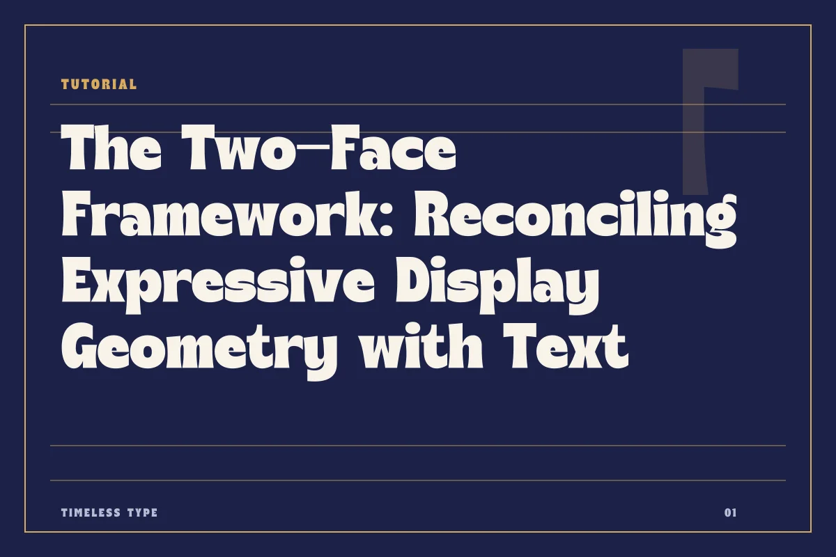
A practical guide to coupling high-character display letterforms with disciplined text faces across posters and brand pages without visual discord.
Table of Contents
Establishing the Division of Labor
Every successful two-font system operates on an uncompromising division of labor. When you choose a display face with pronounced historical markers, unexpected terminals, or idiosyncratic proportions, that face must carry the burden of attitude, voice, and focal attraction. It acts as an architectural monument on the page. The secondary typeface, tasked with long runs of text or supporting information, must perform an entirely different function: it must step back, establish an even grey texture, and deliver reading comfort without asserting its own decorative agenda.
Friction occurs when a designer selects two faces that both demand emotional interpretation. If you set a headline in an expressive cut such as Dream Waves - Serif Display Font, the accompanying paragraph font cannot introduce competing eccentricities like calligraphic swashes, extreme stroke modulation, or whimsical punctuation. Browsing through the catalog at our font library reveals how quickly visual noise compounds when two separate designs simultaneously vie for expressive dominance. The text face must accept its role as structural ballast, grounding the headline rather than echoing every curve.
Measuring Contrast Beyond Stroke Weight
Most pairing guides treat contrast purely as a difference in optical weight—pairing a heavy title with a light paragraph. While weight discrepancy creates immediate visual separation, it is only the coarsest dial at your disposal. Nuanced typographic contrast relies on formal and structural divergence: skeleton geometry, stroke dynamic, and textural rhythm.
Consider how geometric forms interact. A display headline built on circular geometry and crisp, unyielding terminals creates a severe visual rhythm. If you pair it with a humanist text face full of handwritten gestures, open apertures, and asymmetrical counters, the juxtaposition can feel accidental rather than intentional. To build deliberate contrast, keep one foundational axis stable while letting another vary radically. For example, pair a highly decorative serif with a rational, neutral grotesque sans whose stroke thickness remains steady. The text face creates a calm, predictable rhythmic pattern across multiple lines, allowing the distinct silhouettes of the display font to stand in sharp, purposeful relief.
Resolving X-Height and Vertical Proportions
Vertical metrics dictate how large a typeface appears to the human eye, regardless of nominal point size. Two typefaces set at identical points will display vastly different physical presence if one features a low x-height with dramatic ascenders and the other boasts an oversized x-height designed for mobile screens. In a two-face layout, failing to reconcile these proportions undermines the perceived relationship between headline, decks, and body copy.
When a display design has compressed or extreme vertical proportions, dropping straight down to an average text face at 10 or 11 points can leave an awkward compositional gulf. If your headline style possesses compact proportions, such as Glinos - Modern Slab Serif, your subheadings and body copy must be calibrated optically rather than mathematically. You will often need to increase leading and adjust letter-spacing on the secondary face to match the visual footprint of the lead text. Examine the lowercase characters side by side: if the text face looks inflated next to a short-waisted display font, it will overpower secondary headings and blur the reading order.
Common Failure Modes in Posters and Brand Pages
A pairing may look cohesive in an isolated mood board yet unravel entirely once subjected to the messy constraints of real content. On marketing posters, the primary breakdown occurs around secondary details: dates, venues, legal disclaimers, and sponsor credits. Designers frequently make the mistake of setting small navigational or metadata details in a reduced size of the display font. When an expressive display face is scaled below its intended optical threshold, fine hair lines vanish, tight apertures clog with ink or pixels, and legibility collapses instantly.
On brand landing pages, failure often manifests at intermediate breakpoints. Between the massive 72-point hero headline and the 16-point body paragraph lies an entire ecosystem of elements: navigation links, eyebrow tags, callout quotes, and form labels. If your display face cannot survive at 20 points, and your quiet text face lacks sufficient structural grit to command a medium-weight card title, a gap opens in the visual hierarchy. If you force the text face into a faux-bold state to compensate, you introduce muddy contours that degrade the refinement of the entire layout.
Stress-Testing the Two-Face System
Before committing to a pairing for a multi-surface identity or a production poster series, put the combination through rigorous compositional stress tests. Do not test with smooth, balanced Latin placeholders; test with awkward real-world copy that exposes typographic seams.
- Test an all-caps headline featuring numerals, currency symbols, and ampersands against a three-line paragraph of technical copy.
- Render the quiet text face at 8 points alongside the display face at 64 points to verify that the textural density remains harmonious.
- Evaluate the pairing under single-color monochrome constraints to ensure visual distinction persists without relying on color differentiation.
- Build a layout where the text face must handle small caps, tabular figures, and dense bulleted lists without losing its understated voice.
- Examine how the pairing behaves across tight column widths, ensuring that hyphenation and line ragging do not break the optical calm of the text block.
When you restrict your layout to two fonts, you remove the safety net of decorative layering. Every baseline, stroke transition, and counterform is exposed. By deliberately assigning one face to handle expressive energy and the other to maintain uncompromised readability, you create a robust design system capable of carrying complex narratives with precision and poise.
Related
Tags
Browse similar work by purpose and style.