Tutorial
Mapping Typographic Tension: A Hands-On Guide to High-Contrast Face Pairings
Insights, tutorials, and type notes from the Timeless Type studio.
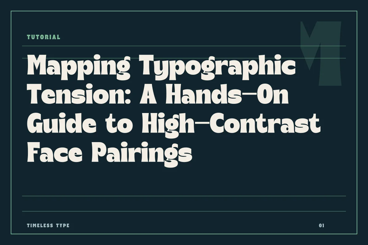
Learn how to anchor dramatic display type against understated body faces by calibrating x-height, stroke modulation, and spatial hierarchy across layouts.
Table of Contents
The Principle of Distinct Roles in Layout Design
A successful layout rarely relies on an equal division of attention. When constructing a poster, landing page, or editorial spread, typography functions best when tasks are compartmentalized: one voice commands the initial glance, while another conducts the steady work of sustained communication. Attempting to harmonize two expressive typefaces inevitably creates visual turbulence. The eye cannot parse where meaning begins when both forms compete for theatrical presence.
Instead, the pairing strategy should resemble an anchor and a kite. The display face provides kinetic character, posture, and stylistic definition, while the supporting body face maintains neutral geometry, stable rhythm, and uninterrupted legibility. To execute this, a designer must dissect the formal anatomy of each face rather than relying on intuitive guesswork or genre conventions.
Evaluating Modulation and Stroke Weight
The first structural checkpoint in any pairing is the degree of stroke contrast. High-personality display faces often employ dramatic shifts between thick downstrokes and hair-thin crossbars, or they rely on monolithic, dense fills. When choosing a companion text face, your goal is not to mimic these shifts, but to select a weight that counterbalances them without introducing a third, conflicting rhythm.
Consider an expressive headline set in a sculptural face like Dream Waves - Serif Display Font. The dramatic swelling, flared terminals, and sharp transition points deliver immediate tension. If your text face attempts to mirror this high calligraphic stress at eight or ten points, the result will be optical vibration and compromised readability. In this scenario, a companion text face requires low to moderate stroke contrast, sturdy serifs, or an unadorned grotesque structure. The difference in modulation clarifies hierarchy immediately: the headline exists as an illustrated mark, while the text block functions as an even tone of gray.
Calibrating x-Height and Vertical Alignment
Proportion errors are the most common reason a conceptually sound pairing disintegrates in production. Even if two typefaces share an identical point size setting, their apparent optical sizes vary dramatically based on the x-height—the height of the lowercase letters relative to the cap height.
A display headline often features exaggerated proportions. For example, a compressed, commanding face such as Newstan – Tall Condensed Sans Serif carries an elevated vertical posture, drawing vertical tension upward. When setting running text beneath a high-altitude title, pairing it with a text face that has a squat x-height and long ascenders creates an uncomfortable disconnect in horizontal cadence. For cohesive reading, assess how the lowercase letters settle on the baseline:
- Select a companion face with a generous, open x-height if your display headline carries heavy horizontal visual weight.
- Increase line leading on body copy by two to four points when the text face has tall ascenders that threaten to clash with the dense baseline of the headline above it.
- Verify tracking: display faces generally benefit from tighter spacing at larger scale, whereas body text requires loose, open tracking to preserve internal counterspaces.
- Confirm optical size adjustments across digital screens to ensure that delicate stems do not drop below rendering thresholds.
Recognizing Points of Mechanical Failure
Every pairing strategy has structural boundaries where the relationship fractures. Identifying these stress points early prevents costly revisions during final art production or client handoff. The most frequent failure occurs when the secondary typeface exhibits halfway characteristics—it is neither fully neutral nor boldly expressive.
A pairing fails when the secondary face shares stylistic quirks with the display face without matching its conviction. For instance, pairing a distinctive, energetic face such as Lemon Burst - Groovy Display Font with an informal, round-cornered body typeface leads to visual confusion. The layout begins to look unconsidered, as if the text face is merely an imperfect, smaller echo of the header. True contrast demands complete ideological distance: the body face must step back entirely, relying on classical geometric or humanist proportions that recede into an uninterrupted reading texture.
Another common breakdown happens through scale compression. A display face built for hero posters or billboard applications often relies on micro-details, sharp cutouts, or hyper-condensed widths that render legibly only above forty points. When designers force such a face into intermediate subheadings—such as section titles at eighteen points—the internal counters fill in, causing the hierarchy to collapse. Maintain an unambiguous size disparity between your headline and body copy, avoiding awkward transitional weights that blur functional roles.
Putting the System into Production
Before standardizing your typography across a branding system or multi-page layout, run stress tests across real-world copy lengths. Mockups featuring single-line headlines and uniform three-line paragraphs rarely reflect real project constraints. Test worst-case scenarios: hyphenated words in the display face, dense tabular data in the body face, and inverted colorways.
Review the comprehensive type library in our fonts catalog to examine how specific structural widths interact across physical and digital formats. Pay close attention to how optical balance shifts when transferring print layouts to responsive web environments, ensuring your designated display face retains its authority while your quiet text face continues its humble, necessary service to the reader.
Related
Tags
Browse similar work by purpose and style.