Tutorial
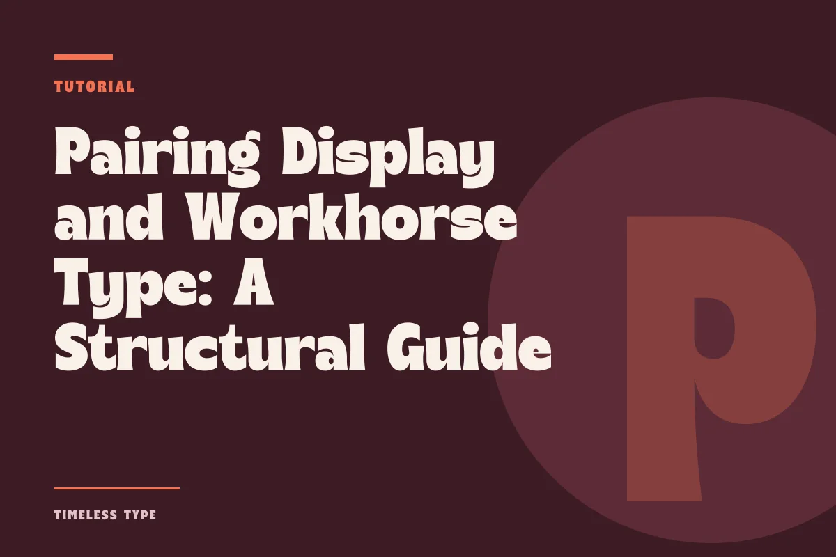
Pairing Display and Workhorse Type: A Structural Guide for Posters and Landing Pages
Insights, tutorials, and type notes from the Timeless Type studio.
A practical methodology for pairing assertive display headlines with calm body type, balancing proportions and x-height to prevent typographic friction on posters and brand layouts.
Table of Contents
Establishing Clear Contrast Across Structural Roles
Every successful two-typeface system relies on an unquestioned division of labor. When laying out a poster, an editorial spread, or a digital landing page, asking two fonts to carry expressive weight at the same time invites visual confusion. The primary display face exists to capture attention, signal aesthetic context, and ground the visual tone of the project. The accompanying text face operates under an entirely different mandate: to convey extended information with minimal friction, dependable legibility, and quiet discipline.
Achieving this functional contrast begins by avoiding near-matches. If your headline uses an assertive retro silhouette such as Manile Vintage - Modern Bold Serif, coupling it with a standard editorial transitional serif creates visual overlap. Because both faces share serif detailing, the eye tries to reconcile their structural differences rather than accepting them as distinct tiers. Instead, pairing a distinctive serif headline with an unadorned, neutral grotesque sans immediately clarifies the reading hierarchy. The contrast must feel deliberate, not accidental.
Calibrating X-Height and Optical Proportions
Contrast in style means very little if the mechanical proportions between the two faces work against the eye. The single most common technical issue in two-font pairings involves the relationship between x-height and optical weight. Many expressive display faces feature stylized vertical proportions, such as exaggerated ascenders, compressed caps, or dramatic descenders, while modern workhorse text families are typically drawn with generous x-heights and open counters to maintain legibility at 9 to 11 points.
When a headline with a compact x-height sits directly above subheadings or intro paragraphs set in a tall-x-height text face, the body copy can appear deceptively heavier and larger than intended, even when set at a significantly smaller point size. To resolve this optical mismatch:
- Evaluate both typefaces at true scale side by side rather than relying on point-size numbers in your layout software.
- Adjust leading in the text face generously to let whitespace compensate for a large x-height.
- Verify that the stroke contrast of the text face does not overpower the thinnest elements of your display letters.
- Test intermediate levels such as kickers and captions in the text face before committing to a final type scale.
By tuning the optical balance rather than relying on mathematical point ratios, you ensure that the text supports the display anchor instead of competing with its physical presence on the page.
Spacing, Tracking, and Leading Under Pressure
Display faces and text workhorses require opposite treatments when it comes to tracking and rhythm. A high-character display face like Dream Waves - Serif Display Font is drawn with individual letterforms that demand tighter, tailored letter-spacing at large sizes. At forty points or higher, loose default tracking causes display titles to disintegrate into detached silhouettes. Tightening the headline draws out the graphic tension between the character shapes, turning the title into a cohesive visual unit.
In contrast, the quiet body typeface requires breathing room. Pulling body text tracking tight creates clumped texture, introduces dark spots on the page, and exhausts the reader over multiline paragraphs. For running text on posters and landing pages, leave tracking at optical default or open it slightly (between zero and plus ten thousandths of an em) while providing ample line leading. When a headline is tightly tracked and the surrounding copy is airy and grounded, the structural rhythm feels intentional and calm.
Recognizing When the Pairing Collapses
A typographic pairing can seem conceptually sound during asset selection, yet fall apart during production. Identifying these failure modes early saves hours of rework across collateral.
Competing Personalities
The most common failure occurs when the secondary text face introduces idiosyncratic quirks of its own. A humanist sans with calligraphic terminals or a geometric face with expressive punctuation will inevitably clash with a bold display headline like Lemon Burst - Groovy Display Font. If both faces demand interpretation, reader comprehension drops immediately. The secondary face must remain functional and neutral.
Optical Weight Collisions
Another point of collapse occurs at intermediate sizes, specifically in lead paragraphs, deck text, and pull quotes. If the text face is scaled up to bridge the gap between title and body, its lack of display refinement can make it look clunky, while setting the display face at sixteen points causes delicate serifs or dense curves to fill in and blur. If an intermediate tier is required, rely on case changes, subtle tracking variations, or disciplined weight shifts within the secondary family rather than forcing the display font below its readable threshold.
A Field Checklist for Posters and Digital Canvases
Before locking in your two-face system for production, test it across the extremes of your layout medium. On a printed poster, step back five paces: does the display mark establish the message instantly, while the body copy recedes into an orderly texture? On a responsive screen, reduce the viewport to mobile dimensions: does the headline maintain its personality without breaking into awkward single-word lines, and does the body font remain effortless to scan against the background?
Exploring curated collections across the Timeless Type library provides an efficient way to experiment with these relationships. When your headline leads with confidence and your body copy performs with quiet precision, your layout achieves an effortless authority that elevates the entire design.
Related
Tags
Browse similar work by purpose and style.