Tutorial
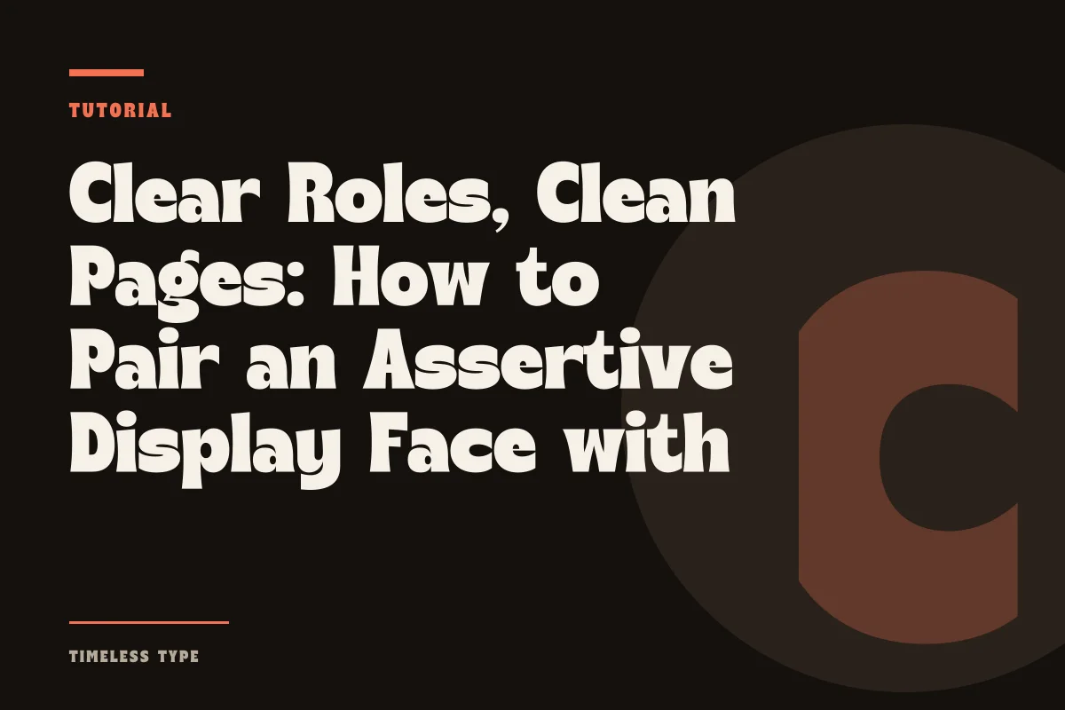
Clear Roles, Clean Pages: How to Pair an Assertive Display Face with Quiet Copy
Insights, tutorials, and type notes from the Timeless Type studio.
Learn how to pair expressive display typography with quiet body copy by evaluating x-height, controlling optical contrast, and diagnosing where layouts fail.
Table of Contents
The Functional Split: Defining the Hero and the Workhorse
Every effective typographic layout relies on an unambiguous division of labor. When you begin designing a cultural poster, an editorial spread, or a digital landing page, your typefaces must not compete for the reader’s cognitive attention. A display face is engineered to capture immediate focus, establish tone, and communicate visual identity at scale. In contrast, body copy exists to carry narrative continuity with minimal friction, guiding the eye effortlessly through lines of text.
When selecting your anchor from our fonts library, treat an expressive choice like Dream Waves - Serif Display Font or the sweeping curves of Flow Botanical - Wavy Sans & Serif Duo as the primary voice of the canvas. Because these letterforms possess idiosyncratic terminals, dramatic thick-thin transitions, or lyrical baselines, your accompanying secondary face must voluntarily recede into the background. The most common error in contemporary layout design is pairing two charismatic choices together, resulting in a composition that feels unstable and chaotic.
Proportional Equilibrium: Aligning Optical Size and X-Height
Pairing is rarely about matching style; it is about calibrating geometry. The visual relationship between a headline and a paragraph depends heavily on the x-height of both designs. If you set a display headline with a remarkably low x-height and long, sweeping ascenders alongside an everyday sans serif with an oversized, modern x-height, the body text can appear disproportionately heavy and clunky, even when reduced to nine or ten points.
To establish harmony across your composition, inspect the internal rhythm of each letterform. A disciplined pairing exhibits proportional awareness through three distinct optical decisions:
- Select body faces with open counters and generous apertures to preserve legibility when set against dense, high-contrast headings.
- Counterbalance extreme display letterforms by ensuring your body copy maintains a stable, horizontal rhythm that settles the eye.
- Verify that cap heights between your subheads and primary text blocks do not conflict with the tracking applied to your display title.
- Test how your body copy renders in multiple weights, ensuring regular or book cuts remain legible without demanding primary emphasis.
For instance, when utilizing an assertive architectural choice such as Newstan – Tall Condensed Sans Serif for an event banner, its vertical tension requires a grounded, wide-proportioned body face to counterbalance the tall, compressed rhythm above it.
Managing Stroke Contrast and Structural Tension
Stroke modulation dictates how much light enters a typographic block. A display font featuring razor-thin hairlines paired with thick stems creates high internal contrast. If you attempt to match this with a high-contrast modern serif for small body copy, the paragraphs will break apart optically into distracting vertical stripes, causing visual vibration that fatigues the reader.
Instead, introduce constructive structural tension. Pair a high-contrast serif headline like Manile Vintage - Modern Bold Serif with an unembellished, low-contrast grotesque or neutral slab serif like Glinos - Modern Slab Serif set at text weight. The slab provides consistent stroke thickness and reliable baseline support, effectively absorbing the dramatic flourishes of the title above. The objective is not uniform sameness, but rather mutual support: one face provides theatrical personality while the other establishes rhythmic calm.
Diagnostic Checklist: Identifying Where the Duo Fails
Even seasoned designers encounter layouts where a pairing looks conceptually sound on paper but falls apart upon execution. Diagnosing these friction points early prevents extensive revisions later in your production schedule. When evaluating your layout, look specifically for these recurring breakdown points:
The first point of failure is tonal competition. If you select a headline face with strong genre associations, such as the retro flourishes of Lemon Burst - Groovy Display Font, do not introduce a body face that also gestures toward the 1970s. The body text must be timeless, objective, and quiet. When both faces make historical or stylistic claims, the design slips into caricature.
The second point of failure is scale ambiguity. When your headline is set at thirty-six points and your body copy sits at eighteen points, they occupy an uncomfortable middle ground. The eye cannot determine which element should command the reading order. Enforce an aggressive scale contrast—often three to one, or even five to one—so the hierarchy is immediately legible from across a room or on a mobile screen.
Applying the System to Posters and Digital Brand Pages
When assembling a print poster, spatial boundaries are fixed. Your display face can command seventy percent of the visual weight, anchoring the upper third of the layout, while the body face occupies concise informational clusters below. In this context, generous line spacing (often 140 to 150 percent) in your body copy gives the dense display type breathing room, establishing a clean boundary between expressive art and practical utility.
On digital brand pages, the dynamic nature of responsive viewports introduces unique constraints. A headline that feels perfectly proportioned on an expansive desktop display might overwhelm a vertical smartphone screen if line breaks wrap awkwardly. In digital environments, test your pairing across varied viewport widths before finalizing font deployment, and ensure your production assets comply with proper licensing through our standard license terms. By establishing clear rules of contrast, geometry, and scale, your typography will maintain both clarity and elegance across any medium.
Related
Tags
Browse similar work by purpose and style.