Tutorial
Precision and Subordination: Disciplines for Coupling Display and Text Faces
Insights, tutorials, and type notes from the Timeless Type studio.
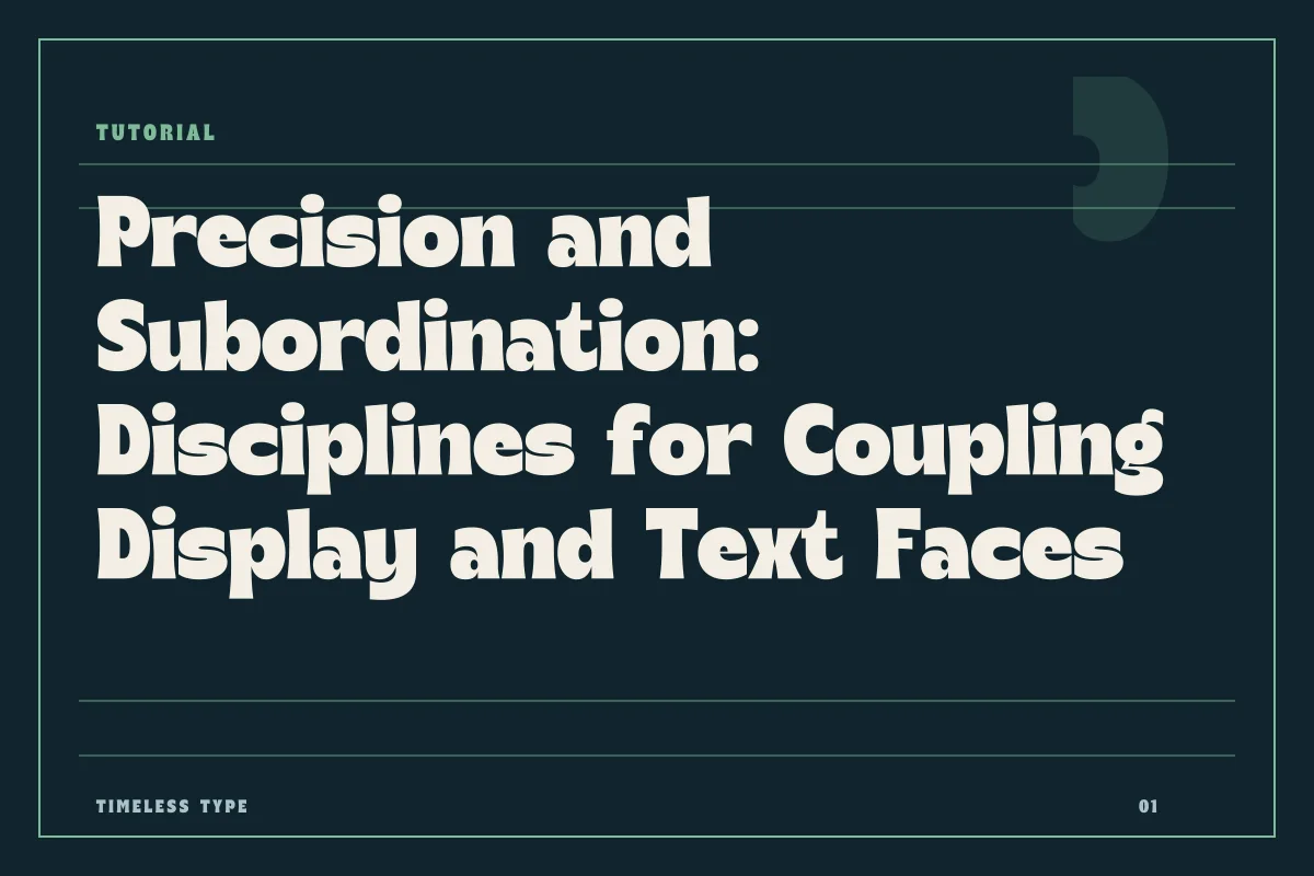
A practical guide to coupling high-character display letterforms with disciplined text faces, focusing on structural contrast, x-height relationships, and common failure points.
Table of Contents
The Principle of Clear Subordination
Pairing typefaces is fundamentally an exercise in structural governance. When constructing an editorial poster, an exhibition sheet, or a digital landing screen, selecting two typefaces often provides more clarity and discipline than relying on an unwieldy family of ten weights. Yet many two-face layouts collapse because the relationship between the primary headline and the accompanying text remains ambiguous. A successful pairing demands decisive subordination: one typeface commands attention through distinct expressive geometry, while the second yields optical primacy to ensure unbroken legibility.
When working with expressive catalog selections such as Manile Vintage - Modern Bold Serif, the headline carries significant visual gravity, marked by strong thick-to-thin modulation and tactile warmth. Introducing a secondary face that also demands attention—such as an equally high-contrast text serif or an expressive slab—creates friction across the layout. The human visual system cannot comfortably prioritize two competing gestures within the same field. To establish hierarchy, the secondary face must act as an anchor, possessing sufficient neutrality to carry factual details without fighting the headline's contours.
Evaluating Optical Contrast and Weight Distribution
Contrast between two faces must be structural rather than merely tonal. A common mistake involves attempting to pair a display face with a text face that is too close in genre, such as trying to match an expressive retro serif with a standard historical serif. In such cases, the minor differences look accidental rather than intentional, producing typographic dissonance. Instead, cultivate contrast across stroke modulation, geometric skeleton, and density.
Consider an experimental or decorative headline face like Dream Waves - Serif Display Font. The undulating curves and expressive silhouettes require a steady counterweight. A restrained, unmodulated grotesque or a humanist sans serif with open counters provides the necessary tension. The crisp, consistent stroke weight of the sans sets a clean geometric foundation that clarifies the rhythm of the layout. When choosing your companion font from our comprehensive collection at Timeless Type fonts, ensure that the body text carries enough stroke weight at small sizes so it does not appear brittle or washed out beside dominant title cuts.
X-Height Relationships and Optical Scale
While contrast creates drama, structural proportion dictates whether the two typefaces can coexist on the same canvas. The most critical metric in this relationship is x-height—the vertical dimension of lowercase letters such as x, o, and n relative to the ascenders and caps. Even though display titles are set at large scales and body prose at small point sizes, their respective proportions still register sub-consciously across the layout.
If a poster headline uses an elongated, condensed letterform like Newstan – Tall Condensed Sans Serif, its narrow proportions and compact lateral footprint must be deliberately acknowledged in the body text. Setting wide, loose body copy directly beneath a severely compressed title can create an uncomfortable optical break. Conversely, choosing a text face with a moderate x-height and generous lateral spacing can restore stability to the lower third of the layout. Pay close attention to how capital letter heights align when subheadings and lead paragraphs sit in close spatial proximity, adjusting point sizes by single-point increments until the optical mass feels balanced.
Mapping Functional Roles in Layout Design
Before locking in a typographic pairing for a project, map every structural element in the design system to a specific typographic rule. Limiting the palette to two distinct voices requires strict boundaries regarding where the expressive voice ends and where the functional voice begins.
- Headlines and hero figures receive the display face exclusively, set with optical tracking and customized kerning pairs.
- Running copy, captions, and fine technical data are reserved solely for the neutral text face to protect reading speed.
- Section subheads should generally lean toward the neutral text family, utilizing a bolder weight or small caps rather than stretching the display face downward.
- Metadata, folio numbers, and tabular credits must maintain rigid spacing metrics, avoiding decorative features that impede quick scanning.
Adhering to these role definitions prevents the expressive qualities of your display face from contaminating quiet reading areas. If you find yourself needing to set an entire paragraph in your display typeface, the structural system has likely failed.
Recognizing and Diagnosing Pairing Failures
Even seasoned layout designers encounter combinations that falter during execution. Recognizing why a pairing fails allows you to fix the underlying structural flaw rather than guessing at arbitrary point sizes or color adjustments.
A frequent failure mode is stylistic competition. When pairing an overtly eccentric cut like Lemon Burst - Groovy Display Font with an idiosyncratic script or a decorative slab, the layout becomes chaotic. The viewer experiences sensory exhaustion because every letterform demands separate interpretation. The solution is straightforward: strip all eccentricity from the supporting face. Select a workhorse text typeface with quiet terminals, rationalized curves, and predictable proportions.
Another common breakdown occurs at the threshold of scale. Certain display fonts disintegrate when reduced to intermediate scales, such as subheadings or deck copy, because their intricate details fill in and their thin strokes disappear. Conversely, setting an understated text face at massive display scales exposes ordinary proportions that lack graphic interest. Respect the physical limitations of each cut. If a layout requires a bridge between a massive headline and standard body text, solve the transition using space, dividing lines, or weight shifts within the text family, rather than forcing the display typeface into spaces where it cannot breathe.
Related
Tags
Browse similar work by purpose and style.