Tutorial
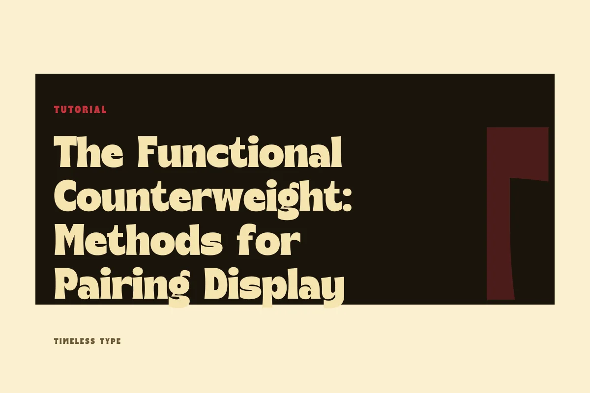
Two Voices in Balance: Reconciling Dominant Heads with Quiet Reading Type
Insights, tutorials, and type notes from the Timeless Type studio.
A practical guide to pairing expressive display typography with quiet text faces, examining stroke contrast, proportion alignment, and early structural warning signs.
Table of Contents
Establishing the Role of the Primary Voice
In any composition governed by two typefaces, clarity begins with unambiguous hierarchy. A single visual surface, whether an exhibition poster or an editorial landing page, rarely tolerates two competing performers. When you select an expressive display cut, you assign it the primary responsibility of setting rhythm, mood, and historical tone. The accompanying text face must adopt an entirely different disposition: service, endurance, and quiet clarity.
Consider an expressive headline face such as Dream Waves - Serif Display Font. Its sinuous curves, delicate transition points, and pronounced terminal details demand room to resonate. If you surround those distinctive forms with a secondary face that also claims idiosyncratic flair, the eye quickly experiences friction. The secondary face should not mirror every curvature of the headline; rather, it should offer structural support, stepping into the background so that extended reading requires minimal cognitive effort.
Measuring Contrast Beyond Weight and Scale
Designers often rely strictly on point size and font weight to create hierarchy. While setting a headline at forty-eight points in bold alongside twelve-point regular text creates baseline distinction, real typographic cohesion requires deeper formal analysis. True contrast operates across structural categories, stroke modulation, and texture.
When examining a display headline, evaluate its internal energy. Does it derive power from sharp geometric angles, or from organic pen-led brushwork? A text companion should offer a counterweight rather than an awkward compromise. Pairings thrive when the structural logic between the two families is clean and resolute:
- Choose geometric stability when supporting lively, illustrative headline lettering.
- Pair monoline or near-monoline sans serifs with high-contrast, modulated serifs to prevent visual vibration.
- Ensure the text face possesses sufficient counterform openness to remain legible when scaled down to continuous paragraph sizes.
- Avoid coupling two faces from the same stylistic movement unless their respective proportions and weights diverge dramatically.
- Test how the pairing holds up when reversed against saturated or dark tonal backgrounds.
By contrasting formal attributes deliberately, you ensure that the reading face recedes into a calm, uninterrupted texture across the lower registers of the page.
Harmonizing Vertical Proportions and x-Height
While stroke modulation and contrast determine tonal balance, vertical metrics dictate spatial comfort. Designers frequently overlook the relative x-height of the body face when balancing it against a dominant headline. A headline cut with compact ascenders and a low x-height produces an entirely different baseline gravity than a headline with soaring vertical stems.
If you pair a headline with deep ascenders and descenders with a body face possessing an exaggerated, modern x-height, paragraphs will appear visually heavier than their point size indicates. The body text may begin to crowd the header space, creating visual competition. Conversely, if your body face has a conservative, traditional x-height, it often accommodates tighter line spacing while maintaining ample breathing room around paragraph blocks. Testing both faces within a single baseline grid exposes these mathematical disparities before they corrupt complex editorial grids.
Recognizing Structural Friction and Early Failure Points
Typographic pairings typically fail in one of two ways: through near-miss imitation, or through irreconcilable mechanical conflict. A near-miss occurs when the text face looks almost like the headline face, but deviates just enough to appear like an oversight. For instance, pairing a humanist text serif with a classical display serif of identical proportions leaves the viewer wondering whether the designer intended a single font family or simply lost track of stylistic consistency.
Mechanical conflict arises when both faces demand equal cognitive attention at similar scales. If you deploy a structured architectural headline alongside Glinos - Modern Slab Serif in subheadings and long captions, the blunt terminals of both cuts will collide. The eye bounces between competing horizontal anchors rather than moving down the composition. If you notice your eye hesitating before dropping into the first paragraph of copy, the secondary face is likely asserting too much decorative weight.
Practical Composition: Rules for Poster and Brand Page Layouts
Translating these principles into finished production requires disciplined layout mechanics. On an advertising poster, where viewing distances fluctuate, the headline must seize attention from across a room while the supporting details remain crisp upon closer inspection. Here, wide physical space between the headline unit and the body block cushions the stylistic jump, allowing you to use more extreme display gestures without destabilizing the secondary copy.
Brand pages and digital editorial layouts impose different constraints. On digital displays, scrolling behaviors bring body copy into immediate proximity with section headers. Keep paragraph type within neutral, well-spaced territory, letting line height provide the necessary buffer. Explore our curated font catalog to observe how varying proportions behave across dense text settings, and always review our clear commercial license terms before integrating new type systems into broad institutional identities. When your headline leads with character and your body type answers with quiet poise, your typography achieves enduring visual harmony.
Related
Tags
Browse similar work by purpose and style.