Tutorial
The Principles of Asymmetric Pairing: Harmonizing Expressive Heads with Quiet Text
Insights, tutorials, and type notes from the Timeless Type studio.
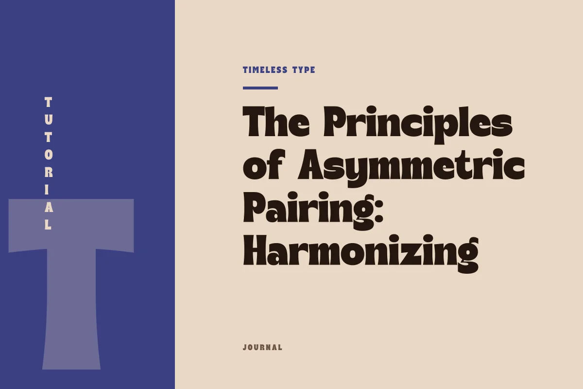
A practical guide to pairing an assertive display typeface with neutral text, focusing on proportion, x-height discrepancies, and avoiding visual friction.
Table of Contents
The Intentional Disparity: Why Visual Distance Works
In graphic design, typographic harmony rarely stems from superficial similarity. Attempting to match a display typeface with a body face that shares slight stylistic mannerisms often produces visual confusion rather than cohesion. The human eye easily detects when two fonts are trying to execute the same aesthetic objective with marginally different accents. Instead, the most enduring layouts rely on deliberate, unapologetic asymmetry. One face takes on the role of the protagonist, setting atmosphere, pace, and cultural inflection, while the other functions strictly as an invisible conveyor of meaning.
When selecting voices from a foundry catalog or reviewing our wider library of fonts, your primary goal is to establish clear role division. A display face earns its presence through distinctive anatomical features: flared terminals, intense stroke modulation, dramatic counters, or tight rhythm. A text face, conversely, succeeds through its ability to disappear into a rhythmic, gray texture on the page. By establishing a wide aesthetic gulf between the two, you eliminate ambiguity and grant each face the freedom to perform its intended job without aesthetic interference.
The Structural Axis: X-Height and Optical Mass
While visual contrast is vital, the two typefaces cannot exist in absolute isolation; they require a shared metric baseline to communicate structural coherence. The most reliable bridge between an expressive headline and quiet body copy is optical mass, largely determined by x-height and stroke proportion.
When a display design possesses an exaggerated character—such as the lush, undulating forms of Dream Waves - Serif Display Font—its visual center of gravity sits noticeably higher or lower than that of conventional reading types. If paired with a text face possessing a tiny x-height and long extenders, the sudden drop in optical density can make paragraphs look frail and disconnected from the headline above. Conversely, a text face with a generous x-height and sturdy vertical stems grounds the layout, offering an anchor against the movement of the title. You do not need the physical x-heights to match in numerical measurement, but their perceived optical mass must feel mutually supportive on the composition canvas.
Diagnostic Benchmarks for Asymmetric Balance
Before locking in a combination for an editorial project, brand landing page, or cultural poster, run the pairing through four structural diagnostics:
- Scale gap validation: Ensure the size difference between the headline and the accompanying text is decisive, typically at least a three-to-one ratio, preventing the fonts from colliding at intermediate sizes.
- Stroke weight compensation: Check that the thinnest stroke of your display letterform is not visually lighter than the primary stem weight of your body copy at reading scale.
- Rhythmic tension: Pair high-movement or gestural titling with a body face that features disciplined, predictable letter spacing and consistent internal counter spaces.
- Proportional width alignment: Balance extreme vertical compressions, such as the architecture in Newstan – Tall Condensed Sans Serif, with wide, legible body text blocks that keep the layout from feeling claustrophobic.
Recognizing Failure Points in the Pairing
A typographic pairing typically deteriorates in three distinct scenarios. The first failure mode occurs in the mid-tier sizing territory, usually between 20 and 36 points. When an expressive headline is dialed down into subheadings, its intricate display nuances become cramped, while an ordinary text face blown up into that same range exposes its utilitarian plainness. If you require functional subheads, assign them to a secondary weight of your text face—such as a clean medium or bold—rather than forcing either extreme to occupy the middle register.
The second failure point is the battle of eccentricities. If your display face carries historical or expressive mannerisms, your body face must be entirely free of novelty glyphs, unusual ligatures, or exaggerated tails. A body face with its own idiosyncratic geometry will inevitably distract from the headline, fragmenting the reader's attention across the spread.
The third breakdown happens when tracking is misapplied. Designers frequently over-track body copy to fill vertical space or tighten display headlines to the point of glyph overlap. This distortion disrupts the internal rhythm native to each design. Respect the native metrics of the reading face, allowing it to hold a steady cadence, and adjust your grid or column width instead of forcing letterforms out of their natural proportions.
Executing the Hierarchy in Layouts and Brand Spreads
Applying this pairing logic requires contextual calibration depending on the medium. In a poster format, the display face carries the primary compositional weight. You can push contrast to its outer limits: an immense headline commanding seventy percent of the frame, countered by an austere, disciplined block of information set in a neutral sans or understated serif. In this environment, generous negative space acts as a buffer, allowing the eye to transition comfortably from the spectacle of the headline to the functional clarity of the event details.
On a digital brand page or editorial article, the hierarchy shifts toward continuous reading comfort. The display face appears intermittently—marking chapter thresholds, landing hero sections, and thematic transitions—while the quiet text face does the prolonged heavy lifting. Maintain generous line height on the prose and ensure comfortable margins between the terminal of a display title and the first line of descriptive copy. When treated with disciplined spatial insulation, an expressive headline and an unassuming text face do not simply coexist; they elevate one another through functional, calculated contrast.
Related
Tags
Browse similar work by purpose and style.