Tutorial
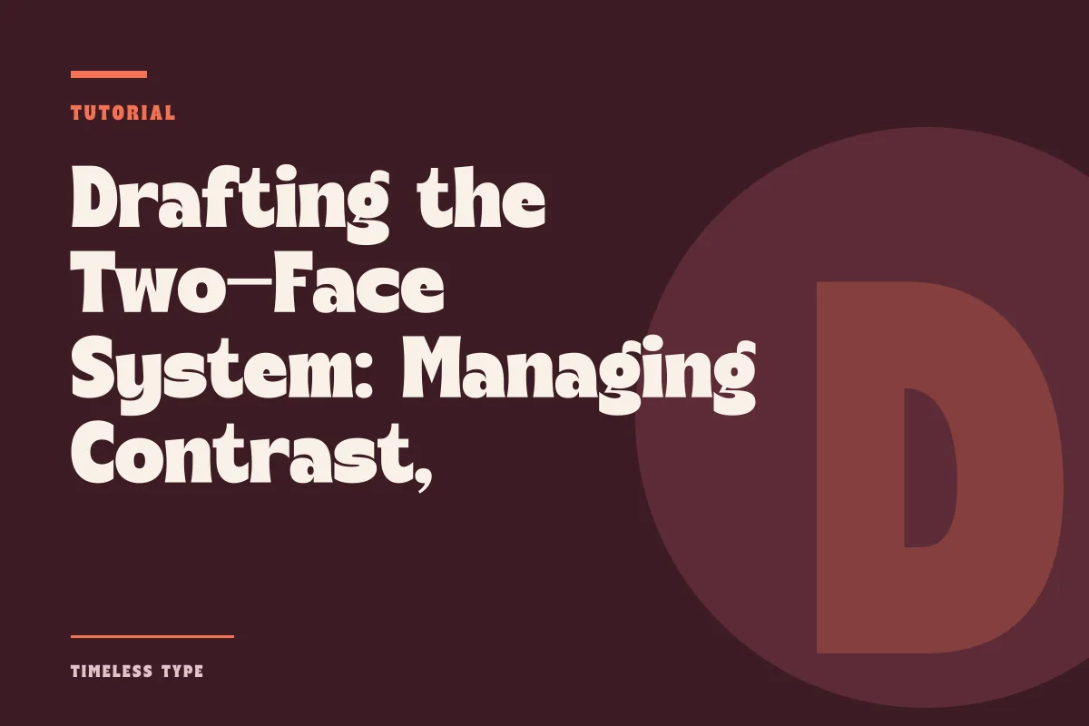
Drafting the Two-Face System: Managing Contrast, X-Height, and Structural Friction
Insights, tutorials, and type notes from the Timeless Type studio.
Learn how to balance an assertive display headline with restrained body copy by evaluating x-height, stroke weight, and structural tension across editorial and brand layouts.
Table of Contents
Establishing Clear Functional Division
Every effective typographic layout relies on an unambiguous division of labor. When a design pairs two typefaces, each family must accept an explicit responsibility. The display face serves as the visual event: it signals tone, establishes era or mood, and commands initial attention from across a room or at the top of a viewport. The supporting text face performs an entirely different task. Its sole purpose is quiet comprehension, providing a continuous reading cadence that never forces the eye to decode idiosyncratic glyphs or awkward horizontal spacing.
Friction occurs when this boundary blurs. If an art director selects an expressive headline style and pairs it with a body face possessing eccentric terminals or unconventional proportions, the reader encounters sensory fatigue. Consider an expressive option like Dream Waves - Serif Display Font used across a large poster title. The undulating serifs and fluid rhythm of such a design deliver high personality in a few words. Attempting to match it with another stylized serif for narrative captions creates visual static. Instead, pairing it with a dry, neutral workhorse sans or a modest humanist serif allows the headline to flourish without compromising the legibility of continuous prose.
Proportional Harmony and the Role of X-Height
While contrast between headline and body copy is necessary, structural compatibility prevents the layout from feeling disjointed. The most critical anatomical metric in this relationship is relative x-height. A display face with an unusually short x-height and dramatic ascenders demands generous vertical breathing room. If the accompanying body typeface has an oversized x-height and stubby extenders, the sudden jump in internal proportions makes the two faces look like an accidental collision rather than a deliberate pair.
When evaluating potential pairings, examine the lowercase letterforms side by side at equivalent visual scale. Look specifically at the relationship between the baseline, mean line, and cap height:
- Assess the lowercase ratio: verify that the text face possesses an x-height generous enough to sustain legibility at 9 to 11 points without appearing swollen next to the headline.
- Compare stroke transition: check whether the display face features sharp, modern contrast or gentle, low-contrast modulation, and choose a text partner whose stem weight feels physically grounded.
- Examine terminal treatment: look at the terminals of letters like lowercase c, a, and r to ensure they do not clash violently in structural attitude.
- Gauge natural tracking: display faces are spaced closely for headline density, whereas body faces require open interior counters and generous sidebearings to prevent optical clumping.
Aligning these foundational proportions ensures that even when the letterforms look visibly distinct in personality, they speak the same underlying geometric dialect.
Managing Stroke Contrast and Texture
The second major mechanical factor is stroke weight and visual texture. Display fonts often push weight distribution to dramatic extremes. A high-contrast design such as Manile Vintage - Modern Bold Serif features pronounced thick stems set against hairline serifs and thin crossbars. If your supporting text face is an ultra-light, hairline sans serif, the layout loses cohesion because both faces rely on fragile thin strokes that dissolve at varying optical distances.
To secure stability, the text face should provide an even, uniform grey on the page. In traditional editorial design, this is referred to as the typographic color. A regular or book weight with moderate stroke modulation anchors the composition, creating a sturdy block of tone beneath the dramatic peaks and valleys of the primary title. When building typographic systems across commercial projects, browsing curated typefaces on our font library can help you identify text candidates that maintain physical presence without fighting the headline.
Identifying Structural Breakdowns and Mismatches
A pairing fails most frequently not because the fonts are too different, but because they are too similar without being identical. If you choose an assertive slab serif for a headline and set the supporting narrative in another slab serif with slightly different bracket curves, the human eye interprets the difference as an error. This visual ambiguity breeds distraction. The brain tries to reconcile why two nearly matching shapes behave differently across headings and subheadings.
Another common point of breakdown occurs when the display face is forced downward into intermediate typographic roles. Display faces are drawn with delicate proportions and tight contours meant strictly for large sizes. The moment you push an expressive title face into deck copy, multi-line pull quotes, or dense subheaders, the counters fill in, thin strokes vanish, and rhythm deteriorates. Reserve your display hero for short bursts of text, and allow your text face—or its dedicated medium and semi-bold weights—to handle the middle tiers of the hierarchy.
Stress-Testing the System Across Physical and Digital Formats
Before committing a typographic duo to an identity guidelines manual or production asset, test the pairing under severe compositional constraints. Lay out your primary headline alongside three paragraphs of real copy, a caption, and an informational table. Print the proof at actual scale for poster and packaging work, or test it on a standard display under varying ambient light for web layouts. Check whether the body text maintains its neutral stance when inverted on dark backgrounds or when column widths contract on narrow viewports.
Consistent testing reveals whether the hierarchy holds together under pressure. When the display face captures interest in a single glance and the text face recedes effortlessly into service, the pairing succeeds. By balancing proportional structure, respecting x-height mechanics, and enforcing strict functional boundaries, you create clean typographic dialogues that elevate posters, brand pages, and publications alike.
Related
Tags
Browse similar work by purpose and style.