Tutorial
The Mechanics of Pairing Display Headlines with Understated Body Copy
Insights, tutorials, and type notes from the Timeless Type studio.
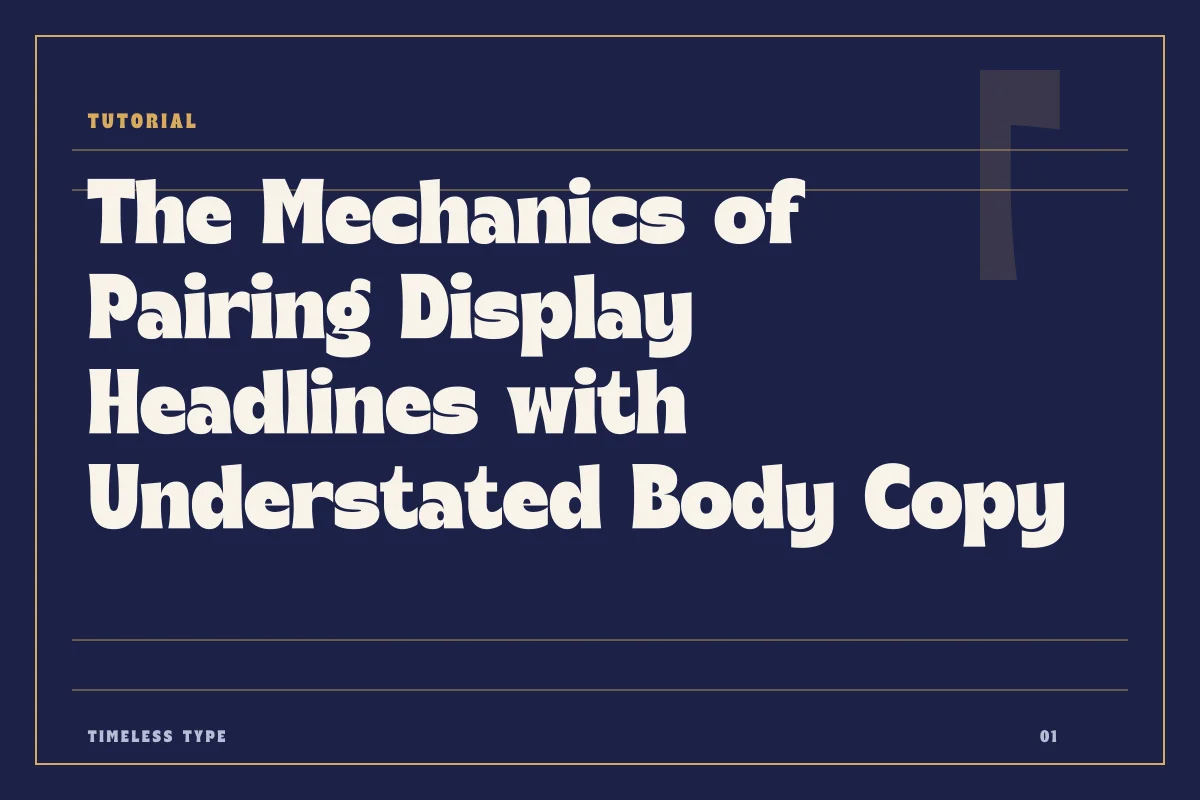
A practical guide to balancing expressive display faces with restrained body text by managing contrast, aligning visual x-height, and preventing structural friction.
Table of Contents
Establishing the Division of Labor
In any composition, typography succeeds when every typeface has an unambiguous responsibility. Problems rarely begin because a designer chooses an expressive headline face; they emerge when the supporting copy attempts to compete with that same energy. A successful pairing does not rely on two fonts having equal visual prominence. Instead, it relies on a deliberate division of labor where the display choice establishes personality, mood, and scale, while the secondary face provides reading comfort, rhythm, and clarity.
When selecting a primary title typeface, such as Dream Waves - Serif Display Font, you are deliberately asking the viewer to register tension, curvature, and stylistic eccentricity. Because the eye expends cognitive effort decoding these intricate gestures at large scales, the accompanying text must offer instant legibility. Pairing is therefore an exercise in balance rather than symmetry. One face commands attention from across the room, while the other serves the eye quietly at reading distance.
Evaluating Proportion, Aperture, and X-Height
The most common technical error when matching display and running text is ignoring x-height and internal proportion. When two faces share an approximate visual x-height, they feel related even if their historical origins differ entirely. Conversely, when a headline face possesses an exaggerated cap-to-x-height ratio and sits directly next to a body face with a dwarf x-height, the hierarchy feels disjointed and unstable.
To evaluate whether your selections will hold together on a poster or editorial grid, examine their interior structures rather than their surface decoration:
- Proportional width: Ensure the horizontal cadence of the text face does not clash violently with the condensed or extended rhythm of your headline.
- Aperture and open counters: Body faces require open apertures to remain readable at nine or ten points, especially against ink bleed or anti-aliased digital screens.
- Axis of stress: An expressive serif with a dramatic vertical axis works best beside a body font with neutral or subtly consistent orientation.
- Stroke transition: If the display face exhibits extreme thick-thin contrast, pair it with a text face possessing sturdy, even strokes to stabilize the baseline.
A structured condensed face such as Newstan – Tall Condensed Sans Serif carries strong vertical momentum. Attempting to pair it with a condensed text face will exhaust the reader; instead, pairing it with a neutral sans or serif that offers generous horizontal breathing room restores balance across the layout.
Managing Contrast and Scale Dynamics
Contrast between two fonts must feel intentional rather than accidental. When two typefaces are too similar—such as two medium-weight geometric sans serifs from different foundries—the composition registers as an unintentional mismatch rather than an intentional pairing. You must create decisive distance between your choices.
Scale is your most effective lever for amplifying contrast without introducing unnecessary type styles. If you set a display title in Manile Vintage - Modern Bold Serif at forty-eight points, your body face should rarely exceed eleven or twelve points. This wide gap in size prevents minor stylistic disparities from clashing. The display face functions as graphic form, while the body face functions as clean texture. When you review complete collections across the Timeless Type fonts catalog, note how typefaces with high character benefit from wide, neutral gutters and generous leadings in the surrounding paragraphs.
Recognizing Structural Friction and When Pairings Fail
Pairings almost always fail due to personality overlap or conflicting structural logic. When both typefaces feature quirky terminal swashes, expressive counterspaces, or stylized ligatures, they shout over each other. The layout loses its focal point, and the reader struggles to determine what requires immediate attention.
A pairing also fails when the secondary face is asked to perform outside its design envelope. Many display fonts include lighter weights, tempting designers to use them for extended multi-column text. However, a face designed for headline impact lacks the optical corrections, open counters, and loose tracking required for comfortable paragraph reading. If your text blurs into an uneven, spotty grey tone on the page, the weight or contrast of your supporting face is fundamentally wrong for body duty.
Layout Applications: From Brand Collateral to Posters
Applying these principles to actual client deliverables requires considering the medium and viewing distance. On a brand identity page or landing screen, the relationship between your display heading and your explanatory paragraph must remain resilient across varying screen resolutions. Keep line lengths between forty-five and seventy-five characters, and let your body text breathe with at least 140 percent line height. This creates a calm foundation beneath an expressive header.
On a printed poster, contrast can be pushed much further. A robust headline can fill two-thirds of the canvas while a tiny block of metadata provides structural grounding at the trim edge. Before finalizing any design system or locking assets into production guidelines, inspect your specimen proofs at actual physical dimensions. A successful typographic partnership never calls attention to the act of pairing; it simply allows the primary message to resonate while ensuring every detail remains effortless to read.
Related
Tags
Browse similar work by purpose and style.