Tutorial
Coupling Expressive Display and Restrained Text: A Practical Guide
Insights, tutorials, and type notes from the Timeless Type studio.
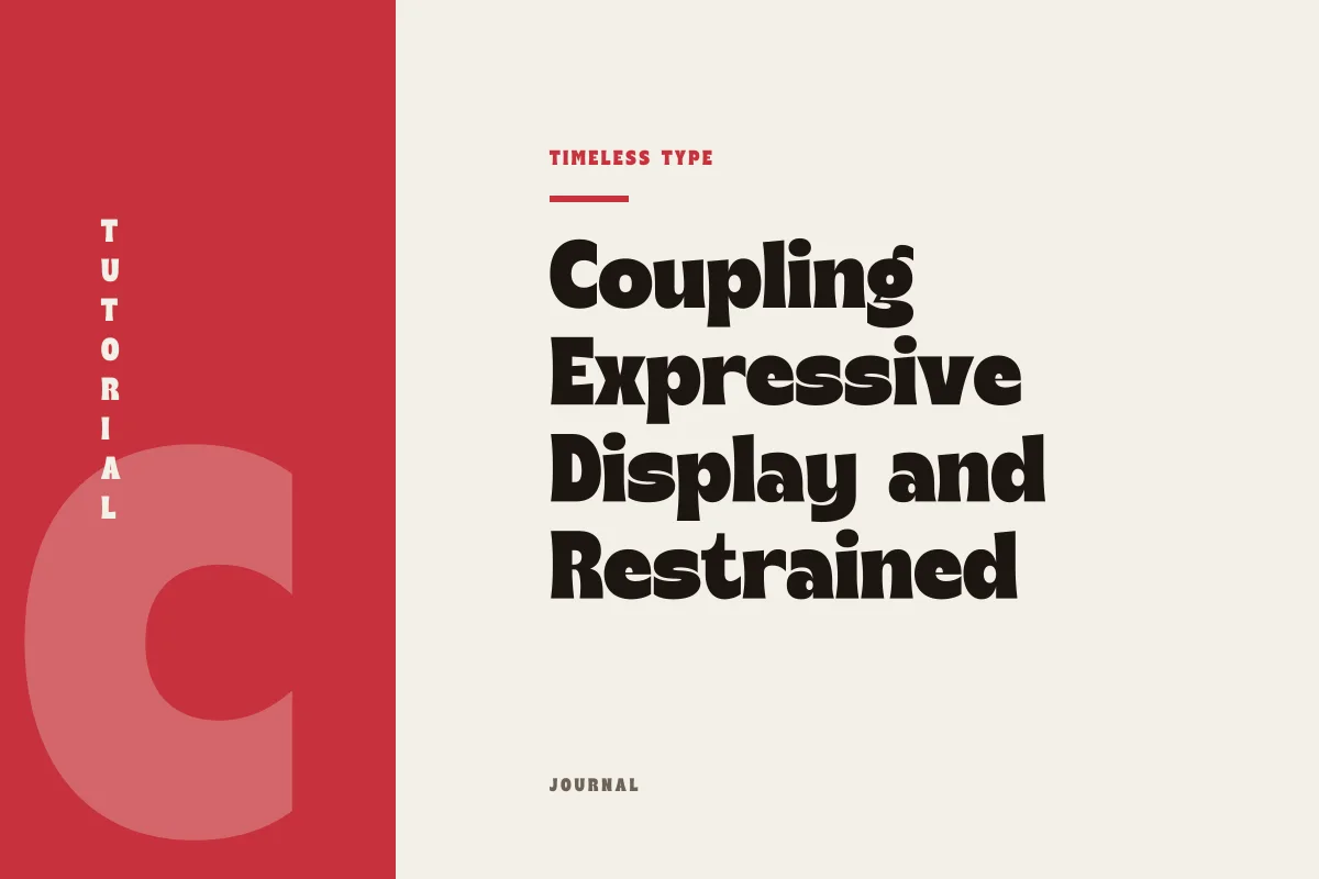
Learn how to anchor distinct display typefaces with understated body copy through conscious management of x-height, contrast, and visual rhythm across posters and brand pages.
Table of Contents
The Functional Role of Two Typographic Extremes
Layouts rarely require more than two typefaces if each voice understands its structural station. In editorial covers, cultural posters, or digital landing pages, combining a high-impact display face with a disciplined, quiet workhorse solves nearly every problem of visual rhythm. The expressive face exists to capture gaze, signal tone, and establish an immediate visual temperature; the secondary face exists to convey information without friction or ego. When this dynamic blurs, the layout devolves into visual competition. Success depends on an unambiguous division of labor, where the headline commands immediate identity while running text remains deliberately transparent and readable.
To make this relationship functional across diverse formats, designers must discard arbitrary matchmaking and focus on mechanical attributes. An expressive headline requires structural support rather than stylistic imitation. If a headline draws attention to its flourishes, curves, or unconventional proportions, the accompanying body face must supply steady horizontal rhythm, predictable word spacing, and invisible reading mechanics.
Balancing Stroke Weight and Structural Contrast
The primary obstacle in two-face systems is accidental resemblance. Pairing two fonts that are slightly different feels like a technical error rather than an intentional compositional choice. If you select an articulate headline such as Dream Waves - Serif Display Font, bringing another medium-weight serif with fluid curves into the body text generates aesthetic mud. The reader senses an uncomfortable kinship without appreciating distinct hierarchy.
Deliberate contrast must govern the relationship instead. Pair high-contrast serifs with low-contrast, geometric or humanist sans serifs. Conversely, set a stark geometric headline alongside a grounded, book-weight transitional serif. When working with historical character forms like Manile Vintage - Modern Bold Serif, the text companion should not attempt to replicate mid-century warmth. A neutral grotesque provides the clean architecture needed to let the display flourishes breathe. The eye immediately categorizes the headline as a self-contained graphic unit and the body block as sustained narrative, eliminating hesitation.
Aligning X-Height and Spatial Cadence
Beyond superficial style, the mechanical anchor connecting two faces is their proportional geometry, specifically x-height, aperture width, and optical density. A common breakdown occurs when a designer chooses a display face with a modest x-height and elongated ascenders, then pairs it with a large-x-height digital sans serif. When placed in proximity, the body type looks disproportionately bulky even at modest point sizes, dwarfing the headline's internal structural logic.
When pairing a vertical, narrow silhouette like Newstan – Tall Condensed Sans Serif with secondary copy, calculate optical volume rather than literal point size. Condensed display forms produce a dense, vertical column of energy. If the text beneath it uses wide counters and loose letterforms, the contrast shifts from dynamic to discordant. Your text face requires open apertures and balanced tracking to create a breathable gray value that anchors the vertical energy above. The display face acts as a dense structural beam, while the text forms an even, quiet field of tone beneath it.
Diagnosing the Tipping Point: When Pairings Fail
Typographic pairings do not fail mysteriously; they fail through specific, observable conflicts in visual weight, rhythm, or stylistic intent. When evaluating a composition on a poster proof or a staging screen, inspect your design for these distinct points of friction:
- Unresolved hierarchy where subheadings set in the text face accidentally match the perceived visual weight of smaller display headlines.
- Conflicting axis angles, such as combining a strongly tilted humanist italic text with an upright, rigid vertical display face.
- Similar stem weights between large body text and smaller secondary headlines, causing the eye to wander between competing focal points.
- Density imbalance, where the display face feels too delicate or spindly to visually anchor a dense, heavy paragraph block underneath.
- Overlapping stylistic personalities, where both fonts attempt to convey nostalgia, novelty, or mechanical futurism simultaneously.
When any of these conditions emerge, simplify the variables immediately. The most direct remedy is usually increasing the point size disparity between the two faces, adjusting paragraph line spacing, or swapping the secondary face for a more neutral, utilitarian cut.
Testing Scales and Establishing Systemic Rules
Before committing a pairing to a complete identity or poster series, stress-test your choices across extremes of scale. A display face that looks immaculate at 96 points on a desktop mockup can easily degrade into an illegible tangle when reduced to 24 points on mobile screens or ancillary print pieces. Keep the display face strictly partitioned to primary titles, hero moments, and compact callouts.
Take time to explore the diverse catalog on our fonts page to evaluate weight variations and proportional baselines before finalizing a layout system. Once your pairing is chosen, lock in specific rules for tracking, baseline grids, and line-height multipliers. When display type is given sufficient breathing room to perform its identity work and text type is trusted to maintain its disciplined quietude, the entire layout acquires the confidence and enduring balance of timeless graphic craft.
Related
Tags
Browse similar work by purpose and style.