Technology
The Enclosed Spectrum: Rethinking Typographic Mass and Proportion in Single-File Formats
Insights, tutorials, and type notes from the Timeless Type studio.
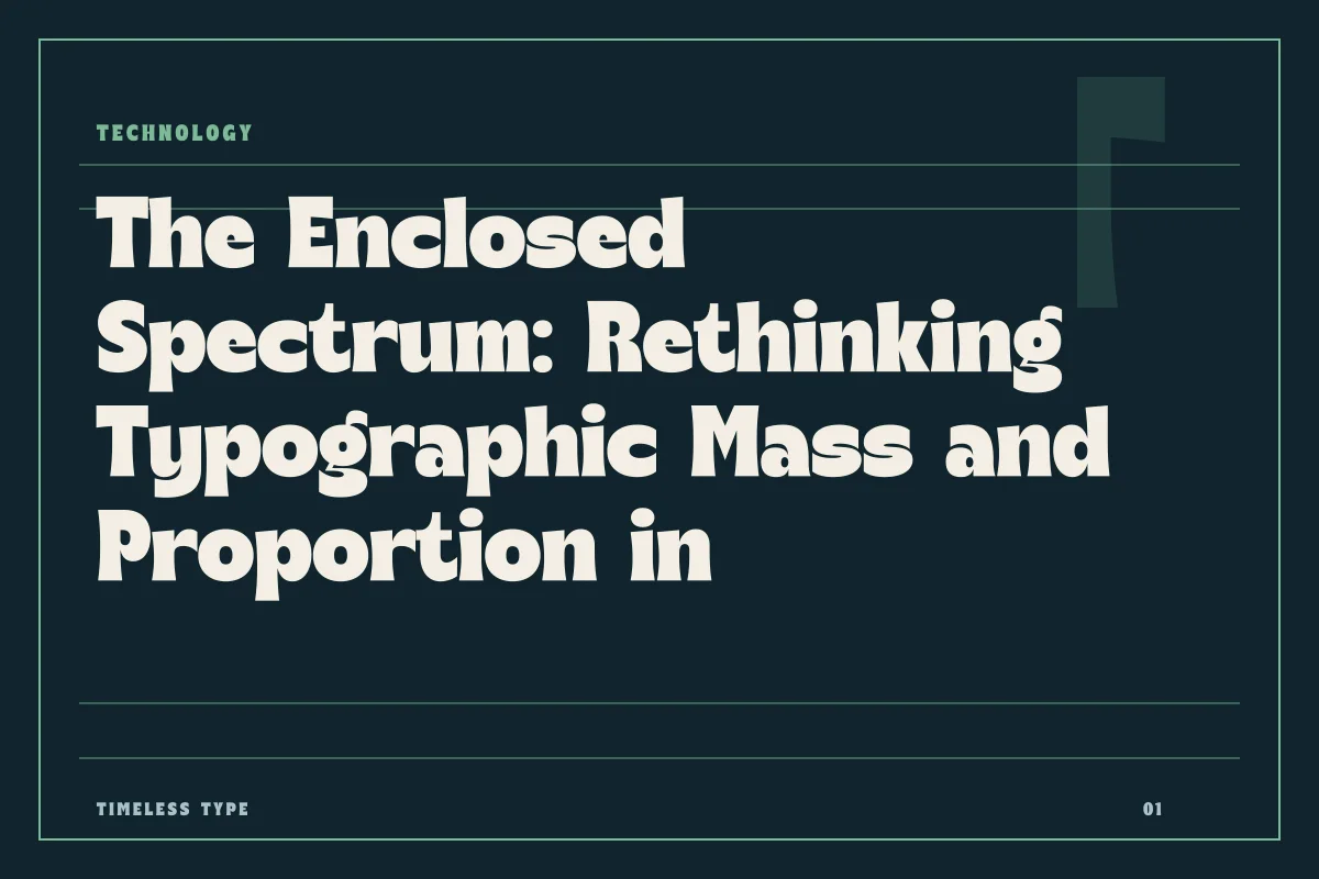
Variable typography replaces discrete static cuts with continuous mathematical spectra, housing expansive ranges of weight and width inside a solitary, efficient digital file.
Table of Contents
The Departure from Discrete Milestones
For centuries, letterforms existed exclusively as fixed objects. In metal, every change in size or heaviness demanded an entirely independent set of physical punches and matrices. When type migrated into digital software, this legacy persisted through discrete font files. A traditional family arrived as an assortment of separate binaries: Light, Regular, Medium, Bold, and their accompanying condensed or expanded companions. Designers learned to navigate layout problems by jumping across these fixed intervals, accepting whatever preselected coordinates the type designer chose to export.
Variable font architecture fundamentally reimagines this premise. Rather than treating a typeface as a collection of isolated snapshots, it defines letterforms as a continuous design space. Within a single font file, the boundaries between thin and heavy strokes, or between narrow and broad proportions, cease to be rigid walls. Instead, they become open trajectories governed by delta transformations. Understanding this transition requires shifting from a mindset of choosing distinct cuts to one of orchestrating fluid typographic mass.
The Mechanics of Internalized Interpolation
At a conceptual level, a variable font achieves its range through master drawings and vector deltas rather than duplicate outlines. In standard font production, an intermediate weight such as SemiBold requires its own explicit outlines for every glyph, contributing significant data overhead to a library or web application. If a layout calls for four weights across two widths, a project must load eight individual files, each duplicating basic font tables, metadata, and kerning rules.
A single variable file eliminates this structural redundancy. The file stores a default set of outlines alongside mathematical instructions that record how specific points shift across continuous dimensions. When you move between structural extremities—such as transitioning from an airy hairline to a dense display posture, or compressing broad letters into compact columns—the rendering engine calculates intermediate coordinates on the fly. Because these adjustments are computed dynamically from shared baseline geometry, the file footprint remains remarkably compact while offering millions of intermediate permutations.
Continuity in Mass and Proportion
The primary axes of variation encountered in functional type design govern mass and proportion: stroke weight and horizontal width. When these parameters exist as unbroken spectra, typographic hierarchy shifts from an act of compromise to an act of precision.
Consider how horizontal rhythm functions across responsive environments. In dense editorial settings, fitting a headline onto a single line often forces an unnatural reduction in point size, which can weaken the voice of the composition. In a variable environment, a designer can subtly compress the proportional width of the glyphs without diminishing their vertical scale or stroke weight. The text remains legible, authoritative, and perfectly proportioned to the spatial constraints of the layout.
Similarly, the range of stroke weight changes how we handle contrast across varying optical environments. Subdued lighting, high-resolution screens, and low-contrast paper stocks absorb or accentuate stroke weight in different ways. An unbroken spectrum permits minuscule adjustments to typographic mass, ensuring that optical density remains uniform regardless of background value or viewing distance.
Static Specialization Versus Continuum Engines
While variable formats deliver unparalleled mechanical flexibility, they do not render static, highly characterized cuts obsolete. Expressive typography often relies on deliberate, idiosyncratic eccentricities that resist smooth mathematical interpolation across a broad continuum.
Dedicated static designs achieve their power precisely because every contour, serif, and terminal is locked to a singular purpose:
- Individual display faces, like the flowing curves of Dream Waves - Serif Display Font, balance delicate hairline transitions that require explicit, deliberate construction.
- Distinct historical interpretations, such as Manile Vintage - Modern Bold Serif, depend on high-contrast drama optimized for specific, impactful sizes.
- Purpose-built editorial structures, seen in Newstan – Tall Condensed Sans Serif or the architectural slabs of Glinos - Modern Slab Serif, provide focused structural discipline directly out of the box.
The true advantage of variable technology lies in systematic consistency. When a face is built to navigate an unbroken continuum of weight and width, it functions as a comprehensive typographic infrastructure, bridging the functional gaps between headline authority and supportive rhythm.
Integrating Continuous Space into Visual Systems
Adopting variable type in everyday creative practice requires restraint. The availability of infinite intermediate weights does not mean a publication should deploy seventeen slightly varied densities on a single page. Graphic clarity still depends on meaningful contrast; readers rely on clear visual demarcations to differentiate between headlines, running body prose, captions, and sidebars.
The value of an unbroken spectrum is not visual chaos, but visual alignment. It allows you to tune a pull quote so its visual weight matches an adjacent rule line, or to slightly open the width of a secondary navigation item without introducing an entirely foreign font file to the technical stack. It provides absolute control over typographic cadence while dramatically simplifying asset management.
As you assess your typographic choices across our catalog fonts or explore practical licensing terms on our licensing page, consider how variable principles transform letterforms from static stamps into responsive instruments. By housing an expansive spectrum within a solitary digital package, modern typography unites engineering efficiency with unprecedented formal precision.
Related
Tags
Browse similar work by purpose and style.