Technology
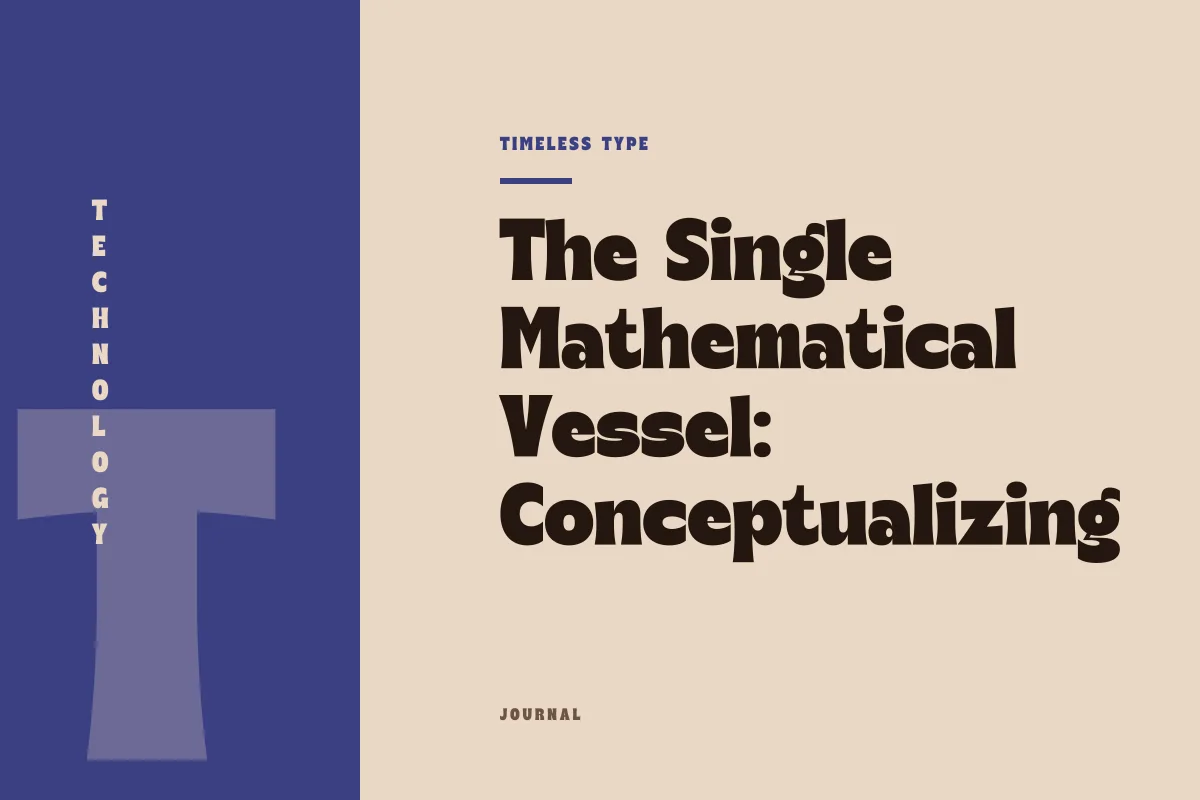
The Single Mathematical Vessel: Conceptualizing Variable Weight and Width
Insights, tutorials, and type notes from the Timeless Type studio.
Variable typography replaces rigid, separate font files with a unified mathematical framework capable of expressing an uninterrupted spectrum of weight and width.
Table of Contents
From Discrete Cuts to a Unified Envelope
For decades, digital typography operated under the physical precedent established by metal type and phototypesetting: each distinct variation in weight or proportion required its own distinct physical specimen or digital file. If a design system demanded a hairline, a regular weight, a bold weight, and a condensed cut, the project had to ingest several discrete font files into its environment. Each file functioned as an isolated island of outline data, storing complete sets of coordinates, point structures, and metric tables independently of its siblings.
Variable font architecture redefines this premise fundamentally. Instead of treating variations as autonomous assets that must be stored and distributed separately, the variable format consolidates an entire spectrum of formal possibilities inside a single file. Rather than serving as an inventory of pre-rendered letterforms, the font becomes a self-contained computational engine. Within this solitary digital vessel, the contours of letters are defined not by static coordinates alone, but by dynamic relationships that shift smoothly across designated ranges.
The Geometry of Internal Interpolation
At the center of variable technology lies the principle of delta-based interpolation. Rather than holding separate drawings for every conceivable thickness or width, a variable font typically stores a primary base outline alongside instructions on how every coordinate point should travel as conditions shift. When a letter changes from an airy, delicate hairline to a robust, ink-dense headline voice, the rendering environment is not swapping outlines out behind the scenes; it is reading mathematical offsets that instruct the vectors to move outward or inward in disciplined paths.
This unified vector structure demands absolute geometric correspondence across the design space. Every anchor point and control handle must have a direct counterpart throughout the spectrum. If a curve in a wide letterform relies on four control points, its compressed counterpart must reconcile the exact same point count in identical sequence. The file is therefore not a collection of arbitrary drawings glued together, but a synchronized, multi-dimensional matrix where every stroke maintains mathematical continuity from its thinnest iteration to its heaviest manifestation.
Weight and Width as Elastic Dimensions
While experimental variable type can govern dozens of expressive transformations, the most transformative conceptual baseline rests on the interplay between weight and width. When these two fundamental structural variables coexist inside one envelope, the typographic palette expands exponentially without multiplying system overhead or design clutter.
In traditional static typesetting, moving between widths often introduces jarring structural jumps. A condensed cut might compress counter spaces abruptly, whereas an expanded cut might feel like an entirely different family. When weight and width exist within a single continuous envelope, those boundaries dissolve into a navigable continuum. Designers can evaluate the spatial requirements of a layout and identify the exact proportion that balances internal volume with column constraints.
Consider how traditional static type collections handle these structural shifts. In our foundry catalog at Timeless Type, distinct static personalities address distinct spatial challenges. A face like Newstan – Tall Condensed Sans Serif organizes verticality and narrow proportions as a definitive, static statement. Conversely, broad architectural statements such as Glinos - Modern Slab Serif or futuristic forms like Hurst Bagod - Futuristic Sans Serif Font deliver fixed interpretations of mass and stance. Variable typography does not replace the artistic value of such dedicated, hand-tuned static expressions; instead, it offers an alternative technical model for applications where the boundaries between proportions must remain pliable.
Practical Advantages in Responsive Environments
Consolidating weight and width into a single file yields profound architectural benefits for contemporary screens, dynamic design software, and complex publication workflows. By shifting the work of generating variations to local rendering engines, production environments gain significant operational efficiencies:
- Bandwidth optimization through solitary asset delivery, eliminating the need to load half a dozen individual web fonts.
- Fluid typographic responsiveness that adapts letter proportions smoothly to viewport thresholds rather than snapping abruptly at fixed breakpoints.
- Micro-typographic optical compensation, where letterforms can expand slightly or gain weight subtly as environmental lighting or text scale changes.
- Frictionless hierarchy adjustments inside layout tools, granting editorial designers infinite gradations between major headings and subordinate captions.
- Streamlined asset management across design systems, requiring only one font file to be distributed, tracked, and vetted under your project’s font license.
Designing with Continuum Rather than Fixed Stops
Working within a continuous typographic spectrum requires a subtle shift in design philosophy. When typography is limited to discrete weights, design decisions are dictated by the available inventory. If the jump from Regular to Bold is too severe, a designer has little recourse other than compensating with point size or tracking adjustments. With variable architecture, the relationship between weight, width, and optical balance becomes completely malleable.
This malleability, however, requires deliberate discipline. The availability of infinite intermediate states does not mean every intermediate value should be used indiscriminately. The most cohesive typographic systems still rely on clear, legible contrasts and disciplined hierarchical intervals. The genuine virtue of variable typography is not the freedom to generate arbitrary novelty, but the precision to find the exact typographic equilibrium that an editorial grid, viewport, or packaging surface genuinely requires.
By housing weight and width within a single mathematical vessel, variable technology bridges the historical gap between the static type specimen and responsive digital design. It transforms typography from an assembly of rigid parts into a responsive material, ready to adapt to the physical and mechanical contours of any composition.
Related
Tags
Browse similar work by purpose and style.