Inspiration
Rooted Foundations: Stroke Contrast, Brackets, and the Architecture of Text Serifs
Insights, tutorials, and type notes from the Timeless Type studio.
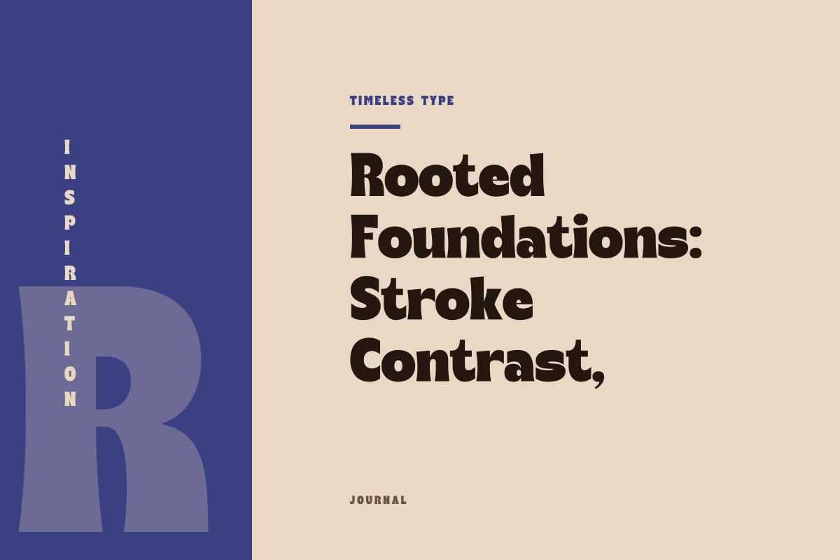
A serif letterform achieves permanence when stroke modulation and bracketed junctions absorb reading velocity without performing historical theater.
Table of Contents
The Divergence Between Costume and Substance
In graphic identity and editorial publication, typefaces are frequently recruited to telegraph historical heritage. When that ambition is pursued superficially, the result is typographic theater: extreme stroke modulation borrowed from romantic nineteenth-century display plates, abrupt razor-thin hairlines, or ornamental ball terminals grafted onto structural stems where they fail to support continuous tracking. Such details create an immediate thematic impression on a poster or packaging mockup, but they quickly dissolve into visual clutter across extended blocks of text. The type behaves like a period costume rather than an authentic instrument of communication.
A settled serif, by contrast, operates on physical logic rather than stylistic nostalgia. It does not mimic seventeenth-century iron-gall ink bleed or nineteen-seventies phototypesetting quirks unless those gestures serve a legitimate mechanical purpose on the page or screen. Understanding what allows a serif to remain comfortable across thousands of words requires looking past period associations and evaluating the geometry of stroke modulation, bracket design, and horizontal cadence.
The Calibrated Scale of Stroke Contrast
Stroke contrast—the ratio between the thickest downstroke and the thinnest hairline—is the primary factor determining whether a serif sits peacefully within continuous narrative or screams for theatrical attention. Display typefaces, such as Manile Vintage - Modern Bold Serif, utilize bold mass and deliberate silhouette tension to anchor mastheads and focal headers. That high contrast gives a title presence, commanding the reader's gaze through abrupt weight differences.
However, when identical contrast ratios are applied to running body prose at ten or eleven points, the reading mechanism fractures. Hairlines pinch down to faint threads that vanish under low-resolution rasterization or light ink coverage, while stressed verticals produce a blinding picket-fence flicker known as dazzle. Settled serifs intended for prolonged reading employ moderate contrast. The transition from thick stem to thin horizontal is tempered, maintaining enough weight in the thin strokes to preserve physical continuity. The letterform remains sturdy under diverse lighting and rendering conditions because its structural core does not depend on fragile hairline bridges.
The Structural Integrity of the Bracket
Serif construction divides broadly into unbracketed joints—where horizontal strokes meet vertical stems at right angles—and bracketed transitions, where a gentle curve or filleted diagonal fills the junction. While abrupt slab constructions like Glinos - Modern Slab Serif leverage blunt geometry for architectural weight, quiet reading typefaces rely almost exclusively on calculated bracketing to settle the line.
The bracket is not mere decoration; it is a shock absorber for the eye. As reading saccades move horizontally across a line of prose, hard right angles generate micro-tensions at the baseline and x-height. A well-sculpted bracket introduces a gradual distribution of visual weight, softening the corner and directing movement forward along the horizontal path. Consider the anatomical traits that define a rooted, unpretentious serif terminal:
- A gradual curve radius that blends the stem cleanly into the serif without creating a dark pocket of trapped ink.
- A flat or subtly concave underside that maintains a reliable contact point with the typographic baseline.
- Proportional extension that guides the eye toward adjacent glyphs without invading inter-character spacing.
- Sufficient vertical thickness at the terminal tip to prevent visual chipping at small optical sizes.
When these variables are tuned in concert, the serifs cease to look like historical garments applied to modern skeleton bones. Instead, they operate as integral foundations, steadying the rhythm of the entire paragraph.
Horizontal Continuity in Sustained Reading
The ultimate test of a serif letterform is neither its appearance on an isolated specimen card nor its silhouette in an oversized brand mark. Its true character emerges across several consecutive pages of dense text. In sustained reading environments, the reader's perceptual focus shifts from individual letter shapes to word boundaries, line lengths, and paragraph texture.
Costume-like typefaces draw constant attention back to their idiosyncratic details: a flamboyant ear on the lowercase g, an exaggerated swash on an uppercase R, or inconsistent counter spaces that disrupt horizontal rhythm. These idiosyncrasies create visual speed bumps. The reader is repeatedly reminded of the font designer's stylistic aspirations rather than the author's prose. A grounded text serif suppresses eccentric flourishes in favor of balanced internal counters, disciplined x-height proportions, and even typographic color.
Selecting Faces for Enduring Projects
When choosing typography for identity systems, publications, or digital editorial platforms, designers must discern whether a project requires decorative personality or sustained functional resilience. Display faces with distinct vintage temperaments, such as Dream Waves - Serif Display Font, bring immense atmospheric value to primary headings, covers, and promotional surfaces where brief, memorable expressions are paramount.
For the core prose that carries the narrative, explore the comprehensive styles across our primary fonts directory, evaluating how each weight manages text rhythm at small scale. Seek out families that temper their historical references with disciplined geometry, modest stroke contrast, and robust bracketing. When letterforms honor the mechanical demands of the reader's eye before adopting stylistic affectations, the resulting typography achieves something far more lasting than period nostalgia: it achieves quiet, enduring authority.
Related
Tags
Browse similar work by purpose and style.