Inspiration
The Quiet Cadence: How Stroke Contrast and Bracketed Serifs Anchor Running Text
Insights, tutorials, and type notes from the Timeless Type studio.
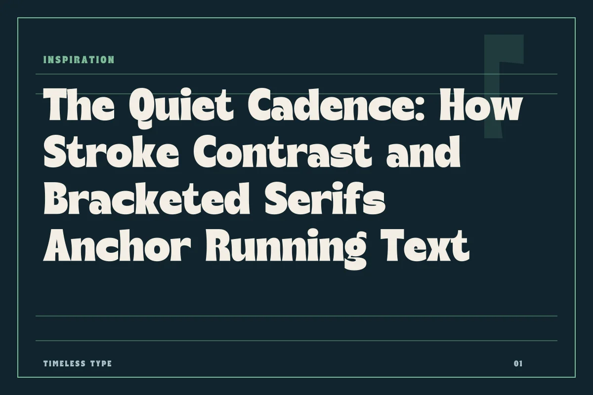
A close examination of stroke modulation, bracket geometry, and optical density reveals why certain serif typefaces settle comfortably into extended reading while others feel like period costume.
Table of Contents
The Difference Between Dress and Utility
When selecting a serif typeface for substantial bodies of prose, designers often confront a curious paradox. Two typefaces may share comparable historical roots, identical point sizes, and similar structural skeletons, yet one reads with invisible fluency while the other feels like an actor clad in period dress. The distinction rarely comes down to historical accuracy; instead, it is an engineering problem governed by optical physics, terminal finish, and stroke modulation.
Costume-like typefaces prioritize theatrical signifiers. They exaggerate idiosyncratic swashes, enforce rigid mechanical mannerisms, or push contrast to extremes that arrest the eye. By contrast, a settled serif behaves less like an ornament and more like an instrument. It yields its individuality to the collective rhythm of sentences, paragraphs, and margins. To understand how this equilibrium is achieved, we must inspect the micro-typographic mechanics of stroke contrast, terminal bracketing, and their combined behavior across the page.
Stroke Modulation: The Threshold Between Sparkle and Fatigue
Contrast—the ratio between the thickest stems and the thinnest hairlines—dictates how aggressively a letterform catches light on paper or pixels. In expressive titling faces like Manile Vintage - Modern Bold Serif, pronounced contrast lends character and commanding weight to short headlines. At display scale, razor-thin brackets and swollen stems create dramatic tension that demands notice.
Transport that same dramatic contrast into twelve-point text set across five hundred pages, however, and the reading experience breaks down. High contrast causes what typographers term dazzle or sparkle: the vertical stems strobe against the page, while delicate hairlines and horizontal bridges vanish entirely under lower resolutions or soft paper absorption. For a serif to feel settled in extended reading, the modulation between thick and thin must remain temperate. The transition from vertical push to horizontal pull must feel continuous, avoiding sudden visual choke points that disrupt the horizontal scanning motion of the eye.
Bracketing and the Dissolution of Mechanical Seams
The serif itself is often misunderstood as a purely decorative flourish left over from stone carving. In functional reading environments, however, serifs serve a vital organizational role: they reinforce the baseline and mean-line, delineate word boundaries, and prevent the interior counterforms of adjacent glyphs from bleeding into each other.
The geometry that connects the terminal serif to the vertical stem is known as the bracket. An unbracketed serif, like those found on strict moderns or structural faces such as Glinos - Modern Slab Serif, joins the stem at a sharp, abrupt ninety-degree angle. This abrupt intersection generates visual tension, emphasizing mechanical geometry. In contrast, a curved, bracketed serif distributes mass into the joint with a subtle radius.
This soft fillet serves two critical purposes:
- It eliminates optical irradiation, which is the optical illusion where sharp interior corners appear pinched or choked when viewed at small sizes.
- It provides visual ballast, smoothing the eye’s lateral transit from one stem down to the baseline and across to the following letter.
- It absorbs ink spread or pixel rasterization inconsistencies, preserving glyph definition across unpredictable substrates.
- It moderates stroke weight, ensuring horizontal terminals do not feel detached from their supporting vertical pillars.
When the bracketing curve is shaped with care, the serif no longer appears tacked on like an external accessory; it emerges organically from the letterform’s skeletal core.
The Test of Running Text: Density Across the Page
A typeface cannot demonstrate its true composure within a specimen sheet of isolated alphabet strings. Its actual character emerges only when hundreds of glyphs aggregate into a continuous grey tone across a two-page spread. This cumulative visual texture, often called the typographic color, reveals every unresolved tension in the font design.
If a typeface is self-conscious or costume-driven, repetitive quirks quickly become rhythmic distractions. An overly eccentric tail on an uppercase letter, an exaggerated ear on a lowercase g, or a self-important terminal on the letter r will recur dozens of times across a single column, forming distracting visual knots. A settled text face demonstrates rigorous restraint in these terminals. The terminals guide the eye smoothly along lines of text rather than demanding individual admiration.
Display variants, such as Dream Waves - Serif Display Font, intentionally leverage expressive movement to evoke mood in focal branding and packaging layouts. Yet when setting sustained editorial compositions, the primary objective flips entirely from performance to transparent utility. The designer’s duty is to curate text faces whose collective rhythm quietly supersedes individual glyph flourishes.
Selecting Settled Serifs for Long-Form Layouts
When evaluating type families in our curated library at fonts or reviewing third-party specimens for publication work, scrutinize the design at the exact operational size of your layout. Look past the charming eccentricities of forty-eight-point headlines and focus directly on how paragraphs coalesce under real reading conditions.
Observe whether the counterforms remain open and calm, whether the apertures invite ambient light into the glyph, and whether the brackets ground the letterforms without creating dark ink pools at the joins. When these structural factors harmonize, the resulting page feels neither archaic nor aggressively contemporary. It simply feels settled, durable, and ready to carry thought without distraction.
Related
Tags
Browse similar work by purpose and style.