Branding
The Conservation of Impact: Balancing Chromatic Saturation Against Structural Form
Insights, tutorials, and type notes from the Timeless Type studio.
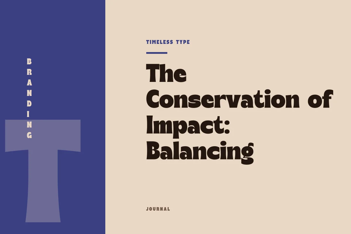
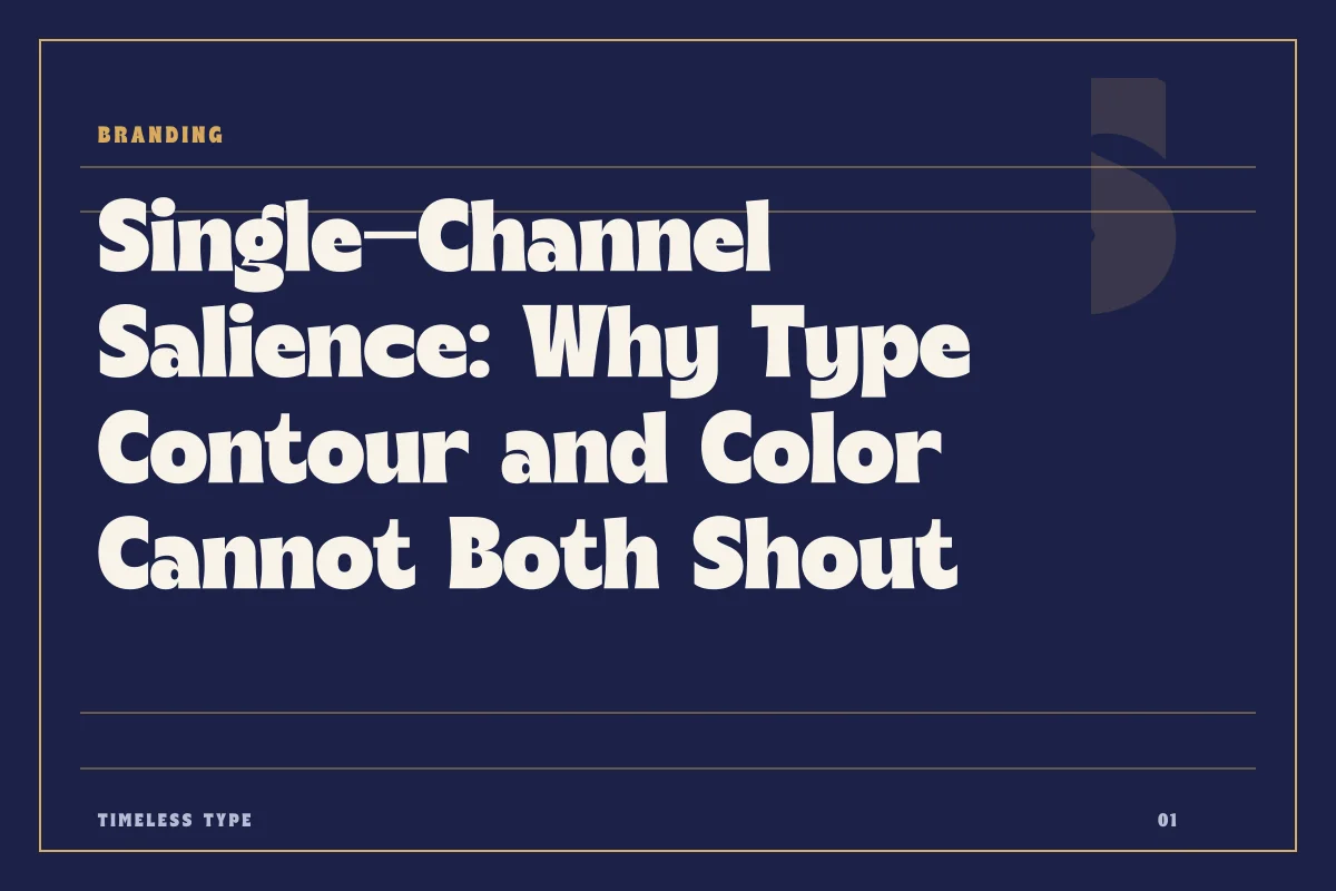
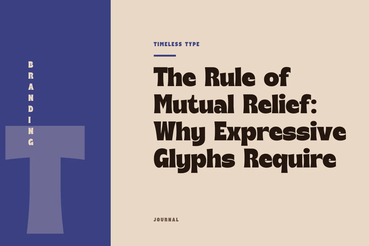
A disciplined brand system assigns dramatic emphasis to either structural letterform quirks or high-saturation color, preserving visual hierarchy by refusing to let both shout at once.
Table of Contents
The Shared Capacity of Visual Attention
Every brand identity operates on a finite budget of human attention. Graphic components rarely live in isolation; instead, they layer across one another in real time, either compounding clarity or generating cognitive static. In contemporary branding, color and typography frequently share the exact same assignment: to announce tone, signal category, and establish immediate recognizability. When an identity system asks both of these instruments to operate at maximum expressive volume simultaneously, optical interference is almost inevitable. The human eye struggles to process two distinct high-salience inputs occupying the same plane, resulting in visual fatigue rather than heightened character.
To build enduring collateral, designers must recognize visual impact as a conserved resource. A layout can accommodate immense drama, unexpected personality, and unmistakable presence, provided that drama is concentrated through a single primary carrier. If the typographic structure carries heavy gestural individuality, the chromatic palette should provide quiet discipline. If the brand signature relies on an aggressive, unforgettable chromatic field, the type should lean into architectural order. The loudest element on the page should be chosen deliberately, never duplicated by accident.
When the Letterform Takes Center Stage
Distinctive display typography brings immense narrative value to a brand. Forms characterized by expressive contours, dramatic waistlines, or sweeping manual brush strokes already supply substantial visual narrative. A typeface like Lemon Burst - Groovy Display Font or the sweeping physical gestures of Whitela Akuatic - Bold Brush Font creates an instantaneous impression through stroke modulation and structural rhythm alone. In these contexts, the silhouette is the primary messenger.
When letterforms possess this degree of structural theater, introducing a vibrant, multi-hued chromatic palette tends to obscure rather than elevate the craft. High-chroma gradients or conflicting secondary primaries visually slice through counter spaces, distracting the eye from the deliberate tension of terminal curves and baseline rhythms. By setting such assertive type in monochromatic tones, grounded charcoals, off-whites, or deep single pigments, the letterform’s idiosyncrasies are allowed to breathe. The typographic contour retains its punch, while the color palette steps back to provide necessary physical contrast and commercial poise.
Granting Primacy to High-Intensity Pigment
The inverse principle holds equal weight. Many memorable brand systems are founded on an arresting color signature—an electric safety orange, a piercing cobalt blue, or a radiant citrus tint that demands immediate peripheral attention across crowded retail shelves or digital feeds. When pigment is the chosen vehicle for disruptive brand equity, letterforms must adjust their posture to support that chromatic lead.
Forcing an intricate, eccentric typeface into a radiant, high-chroma field causes sensory confusion. The eye is pulled between dissecting complex anatomical quirks and adjusting to intense chromatic energy. In these systems, structural discipline is paramount. Pairing a high-energy palette with an architectural, clean asset like Newstan – Tall Condensed Sans Serif or the grounded weight of Glinos - Modern Slab Serif yields maximum clarity. The type executes its functional task of semantic transmission with unyielding legibility, allowing the vibrant field to handle the emotional and associative weight of the brand.
Diagnosing Cognitive Overload in Brand Surfaces
Identifying the tipping point between dynamic tension and visual friction requires evaluating how brand components behave across varying applications. When both typography and color compete for dominance, systemic failures quickly emerge across touchpoints:
- Retinal edge vibration: Saturated complementary hues set against intricate serif brackets or jagged contours produce optical halos that compromise extended legibility.
- Unclear focal hierarchy: Viewers fail to prioritize information when structural display quirks and loud background blocks battle for initial attention.
- Micro-scale degradation: Display faces with delicate idiosyncrasies dissolve into formless noise when printed or rendered in low-contrast, high-energy palettes at small sizes.
- Weakened brand recall: Consumers struggle to form a coherent mental imprint when forced to process two conflicting aesthetic statements at the same time.
Calibrating the Systemic Balance
Achieving harmony between contour and pigment requires treating typography not as a decorative afterthought, but as an integrated mechanical component of the brand palette. When surveying the catalog in our library of display and text fonts, evaluate how each specimen interacts with your designated chromatic palette before locking system guidelines. Distinctive options such as Dream Waves - Serif Display Font possess ample intrinsic presence to command a layout without relying on loud, distracting pigment combinations.
Great design systems emerge from calculated restraint rather than maximalist competition. By establishing whether typography or color carries the primary thematic voice, you protect your system against compositional chaos. Let the letterform shout when its structure tells the story, or let the color field lead when vibrancy is the brand signature. Deciding which voice remains quiet is the true discipline of lasting visual identity.
Related
Tags
Browse similar work by purpose and style.