Branding
Governing Visual Amplitude: Why Color and Typography Cannot Both Take the Lead
Insights, tutorials, and type notes from the Timeless Type studio.
When brand identities deploy saturated color and idiosyncratic typefaces simultaneously, message clarity degrades; giving one element the quiet role restores hierarchy and emotional resonance.
Table of Contents
The Redundancy of Dual Amplification
In graphic design and brand identity, every component on a surface demands an investment of visual attention from the viewer. Color and typography perform remarkably similar emotional and communicative work: both signal tone of voice, establish brand positioning, generate atmosphere, and guide reader navigation. Because they draw upon the exact same pool of cognitive focus, treating both channels as primary focal points at the same time is usually counterproductive.
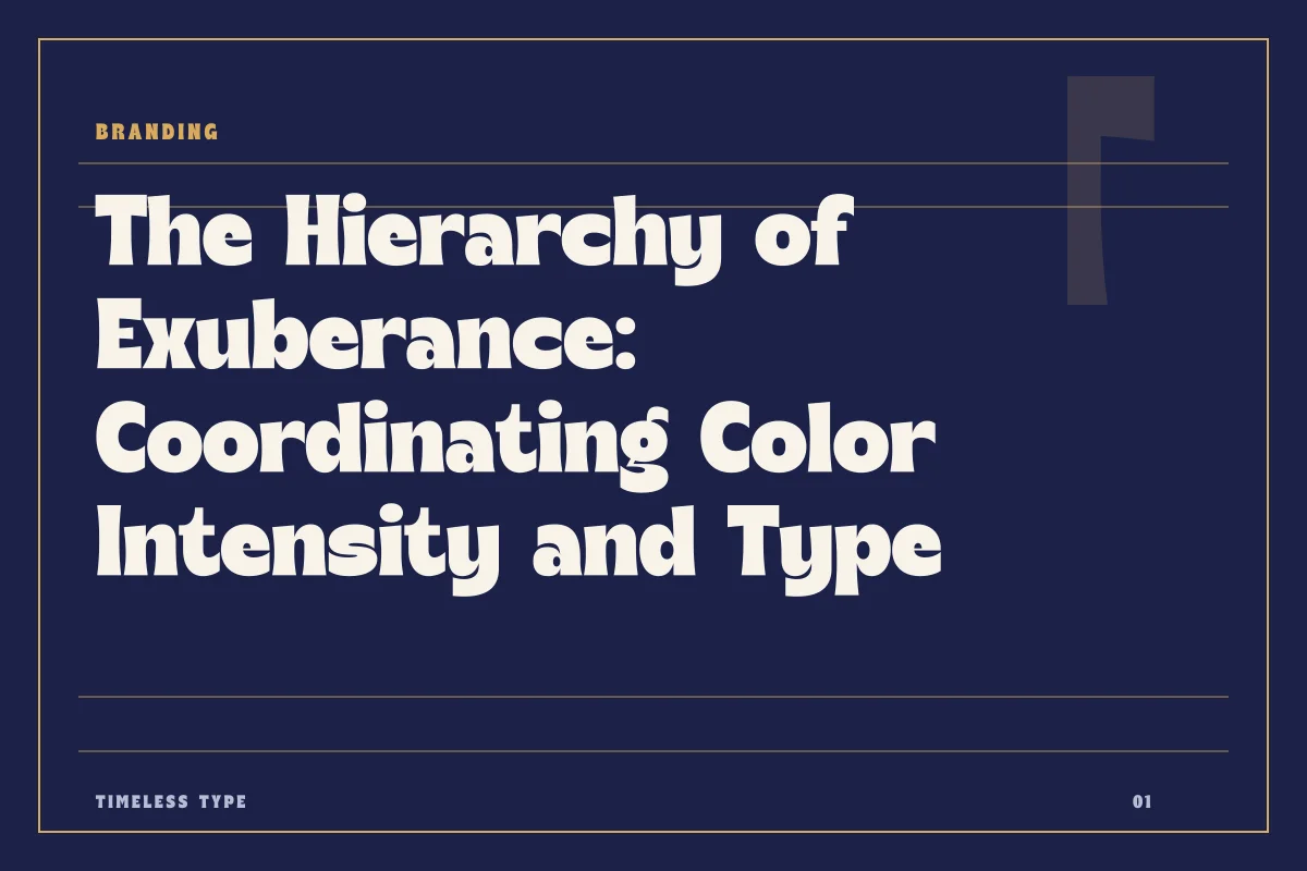
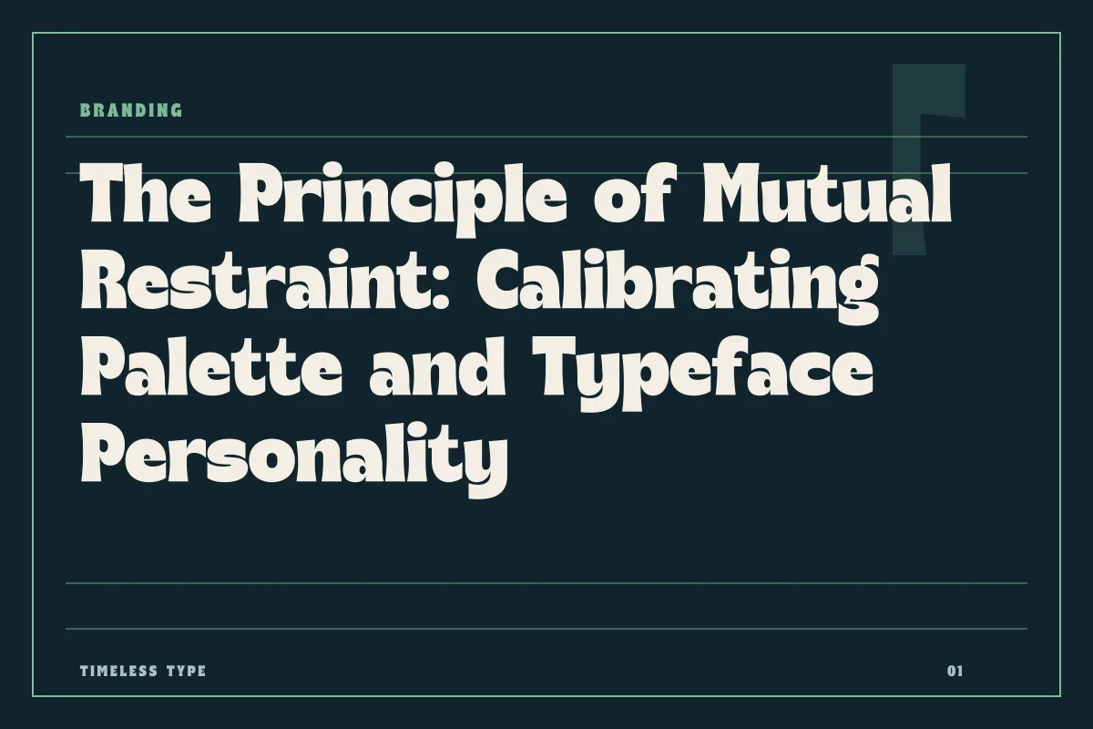
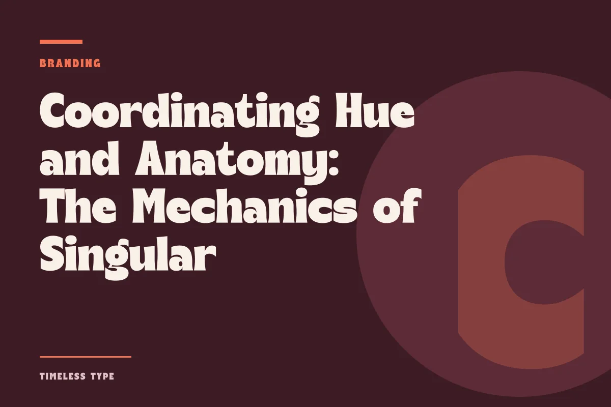
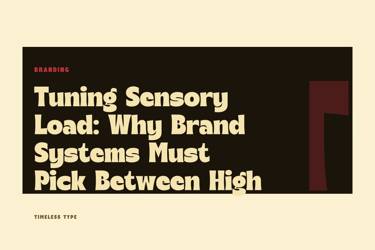
When a designer pairs an eccentric, high-personality display font with an aggressive, saturated multi-hue color scheme, the layout does not communicate twice as forcefully. Instead, the signals scramble each other. The eye flits between the unexpected gestures of the letterforms and the vibration of high chroma, unable to discern which cue indicates primary hierarchy. Restraint in one channel allows the expressive qualities of the other to register with absolute clarity.
When Letterforms Take the Stage
If an identity relies heavily on typographic uniqueness to establish its distinction, the color palette must willingly step back into an architectural, supporting posture. Typefaces that possess dramatic rhythm, experimental stroke logic, or pronounced historical weight—such as Lemon Burst - Groovy Display Font—carry immense graphic weight. The curves, terminals, and counterspaces already supply substantial visual narrative.
Applying an electric neon gradient or a turbulent multi-color palette to such expressive glyphs introduces optical noise that blurs letterform recognition. A sculptural display face gains authority when rendered in deep obsidian, warm bone, understated earth tones, or deliberate monospaced tints. In the same way, the stark geometric architecture of a face like Xeura - Modern Futuristic Display commands modern space when set against high-contrast neutrals, allowing its engineered terminals to cut through the canvas without chromatic distraction.
Letting Chromatic Intensity Lead the System
The inverse principle holds equal strategic value. Many brand systems differentiate themselves predominantly through an explosive or unconventional palette—fluorescent pastels, unexpected primaries, or saturated color-field collisions. In these systems, color is the primary carrier of identity, shock value, and emotional warmth.
When the palette commands the room, the letterforms must supply structural discipline. If an identity features high-impact, vibrating backgrounds or chromatic layering, the typographic system should prioritize balance, structural clarity, and consistent optical density. Using a grounded presence like Glinos - Modern Slab Serif or a disciplined silhouette like Newstan – Tall Condensed Sans Serif anchors the packaging or screen interface. The type provides the legible scaffolding, ensuring that critical information remains unmistakable while the palette creates the immediate emotional resonance.
Diagnostic Signs of Visual Competition
Determining whether a layout suffers from dual amplification requires honest technical evaluation. Designers can assess whether letterforms and color palettes are collaborating or competing by checking several concrete baseline conditions across real applications:
- The squint test: If closing your eyes halfway causes the headline to blend into or visually cancel out its background, the contrast is failing because the form and chroma are competing for equal optical attention.
- Hierarchy exhaustion: If viewers cannot pinpoint whether the headline's expressive tone or the background's hue is the core identifier, both elements are operating at maximum amplitude simultaneously.
- Sub-element collapse: When the headline and color are both dialed up to maximum loudness, secondary elements like metadata, dates, navigation, and body copy become invisible or visually stranded.
- Cross-media breakdown: A high-chroma, high-personality typographic pairing that looks barely tolerable on a calibrated display often becomes unreadable when printed on matte paper or scaled down for mobile displays.
Building Sustainable Equilibrium Across Brand Systems
A mature visual identity system rarely relies on a single rigid setting. Instead, it provides brand custodians with an intentional sliding scale. For central display moments—such as editorial covers, environmental signage, or headline packaging—the design team can decide explicitly which lever to engage. If a campaign relies on a bold color block to command attention on the street, the typographic choices remain disciplined and structural.
Conversely, when a brand moment calls for warmth, craft, or singular expressive presence, pulling back the color palette to a restrained, two-tone framework permits the typographic curves to do the heavy lifting unhindered. When exploring the catalog of foundry typefaces, evaluate potential pairings not merely in isolation on a blank page, but against the intended palette's tonal saturation. Give one element the clear lead, grant the other the supporting role, and allow the layout to communicate with calm, unmistakable clarity.
Related
Tags
Browse similar work by purpose and style.