Branding
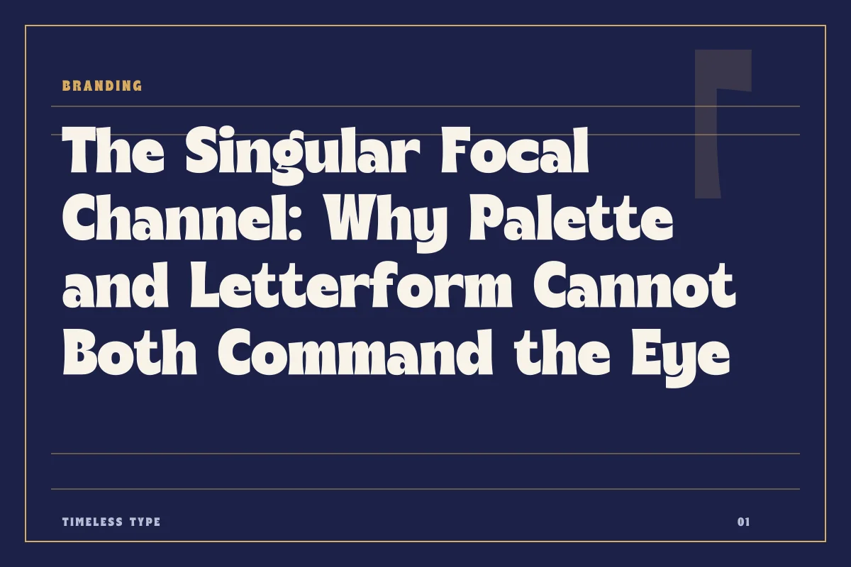
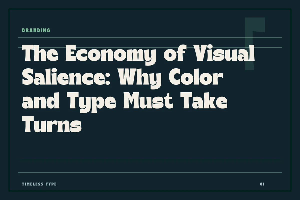
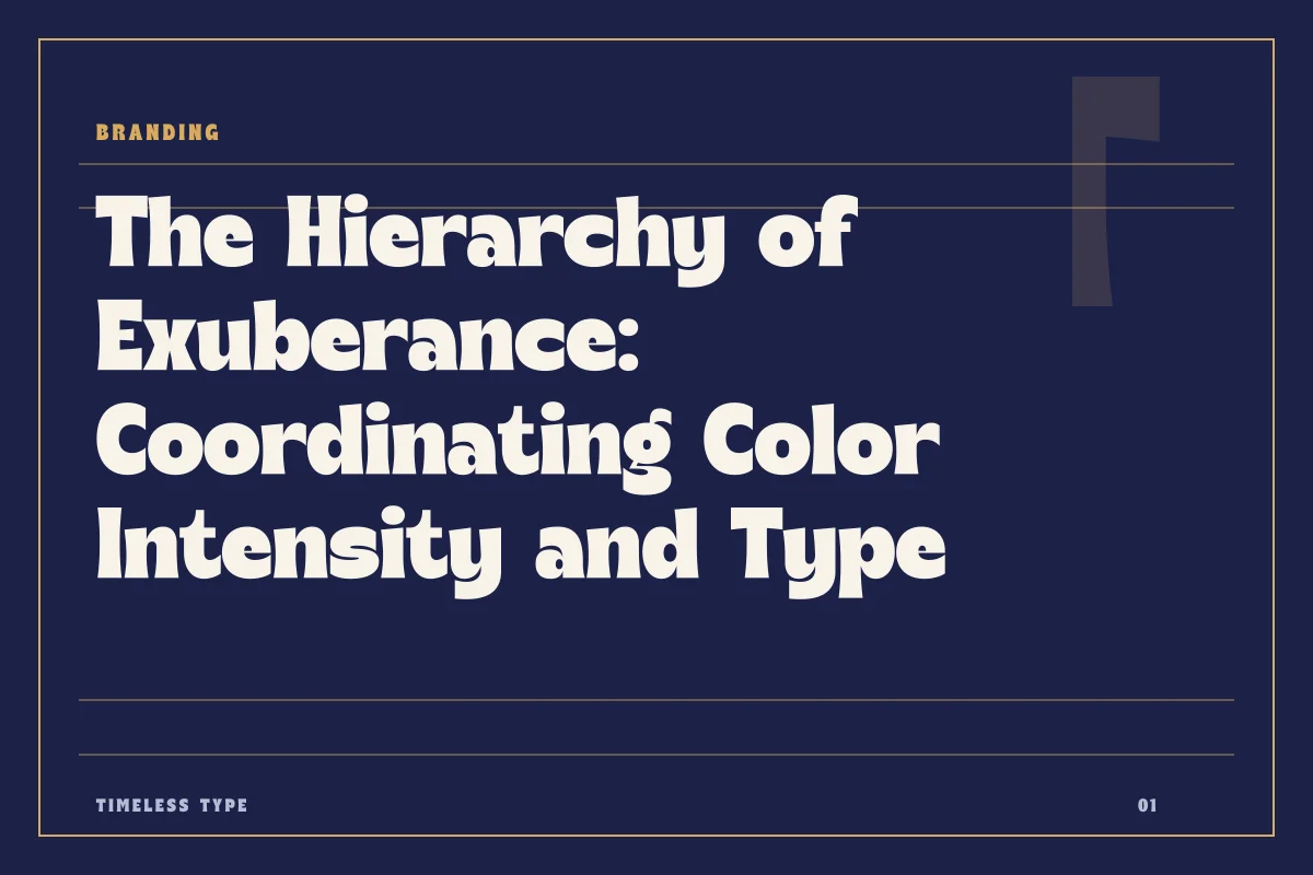
Distributing Focal Pressure: Why Typography and Color Cannot Both Carry the Accent
Insights, tutorials, and type notes from the Timeless Type studio.
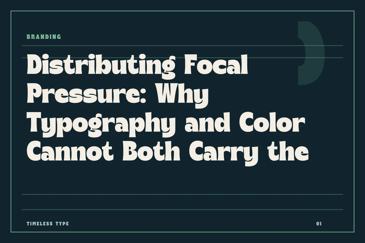
When branding systems demand high sensory impact, pairing flamboyant letterforms with saturated palettes creates visual friction instead of clarity.
Table of Contents
The Shared Mandate of Type and Color
In identity design, letterforms and color palettes compete for the exact same slice of human cognition. Both elements exist to communicate tonal attitude before a reader digests a single sentence of copy. A radical stroke contrast or an unconventional contour signals rebellion, refinement, or urgency just as immediately as an unvarnished cadmium red or a fluorescent acid green. Because typography and chromatic saturation pull identical cognitive levers, treating them as independent variables is one of the most common pitfalls in contemporary branding.
When an identity system dials both channels to maximum volume, the result is rarely double the impact. More often, it produces visual cancellation. High-energy colors refract and obscure the fine silhouette of expressive glyphs, while complex, sculptural letterforms break apart the solid field of pure hue. To construct an arresting visual identity that remains legible across digital platforms and physical ephemera, designers must learn to assign expressive leadership to one medium while tasking the other with spatial discipline.
Letting the Letterform Command the Room
When the core emotional payload of a brand relies on structural idiosyncrasy, typography must occupy the foreground unhindered. If a brand uses a typeface loaded with sweeping curves and historic resonance, such as Lemon Burst - Groovy Display Font or the dense, architectural weight of Xeura - Modern Futuristic Display, the letterforms are already executing heavy conceptual work. The eye needs calm surface tension to appreciate counter spaces, swashes, and rhythm.
In these compositions, chromatic restraint is what grants the letterforms their authority. Setting an expressive display face in dense carbon black, off-white, raw canvas, or muted earthen pigments allows the viewer to absorb its anatomical precision. If that same expressive headline is rendered in an electric rainbow gradient over a hot magenta backdrop, the silhouette collapses into visual noise. Restrained palettes act as architectural concrete: quiet, reliable surfaces that allow structural typography to cast clear, legible shadows.
Allowing the Palette to Drive the Energy
The inverse principle holds equal power. Many brand strategies require aggressive, hyper-saturated color palettes to signify digital native energy, youth culture, or commercial velocity. In environments saturated with intense cobalt blues, solar yellows, or hyper-pigmented oranges, the typography must willingly step back into an anchor role.
When color provides the primary theatrical gesture, typefaces should prioritize clarity, geometry, and negative space. A disciplined condensed face like Newstan – Tall Condensed Sans Serif or the grounded cadence of Manile Vintage - Modern Bold Serif brings structured order to high-chroma fields. By adopting predictable proportions and clean contours, the typeface gives vibrant colors a precise framework to inhabit. The typography stabilizes the composition, ensuring that the brand registers as confident and deliberate rather than frantic.
Diagnosing Structural Friction in Brand Systems
Determining whether a system has overspent its sensory budget is a diagnostic skill. When reviewing packaging layouts, digital hero banners, or signage mockups, designers can evaluate the interaction between type and hue by identifying recurring warning signs:
- Headline silhouettes become unreadable against background fields unless heavy drop shadows or outlines are applied to artificially rescue contrast.
- The focal point oscillates uncomfortably, leaving the viewer unsure whether to examine the novelty of the glyphs or the intensity of the surrounding chromatic field.
- Secondary text blocks require aggressive sizing increases simply to remain visible amid the surrounding chromatic vibration.
- Brand touchpoints lose consistency quickly because the system provides no neutral territory for mundane, utilitarian communications.
If any of these conditions appear during prototyping, the solution is almost never to add a third graphic element. The remedy is to subtract energy from one of the primary channels until the dominant partner emerges clearly.
Calibrating Long-Term Brand Durability
Systems that balance expressive type with disciplined color—or quiet type with electric color—possess a structural longevity that dual-maximalist designs cannot sustain. A brand that shouts across every sensory channel simultaneously burns through viewer goodwill and limits its own operational range. Consider how an editorial report, an invoice, or a customer service touchpoint functions within a brand world where every element is set to extreme amplitude; the system invariably breaks under the demands of boring, necessary information.
By treating typographic anatomy and color saturation as complementary halves of a single energetic budget, you build identities that can flex between high-concept brand campaigns and everyday digital utility. Explore our complete library of display and editorial families at our typography catalog, and review commercial parameters via our licensing terms to ensure your next brand system balances expressive strength with functional longevity.
Related
Tags
Browse similar work by purpose and style.